
T
Thierry Ciot
Guest
Ratings are use everywhere today. Learn how to create a custom rating component with Kendo UI Builder, the low-code Angular application designer.
Star rating components are quite popular these days, whether for showing how great a travel destination is or how expensive a restaurant is. Here is a visual example:

In this blog we are going to see how we can easily create such a rating component in our apps with Kendo UI Builder. Here are the parameters of the component we would like to be able to control:
To follow along, download the template sample zip from github or clone the repository, open folder templates/components/custom-rating-comp-v1/ and follow the instructions outlined in this post to install this template in your target application. The sample is specific to the Angular framework.
As usual, we will look how the component is defined (the component definition file), how it renders at design-time and finally how the run-time portion is implemented.
Component Definition
Open the file components/custom-rating-comp/custom-rating-comp.json
It contains similar properties as the basic component sample, so these should be familiar to you. If not please refer to this blog post.
The new properties we are interested in are:
"icon": {
"type": "string",
"title": "Icon",
"editorType": "icon",
"editorRowType": "window",
"default": "fa fa-star",
"order": 2
},
"color": {
"type": "string",
"title": "Icon Color",
"description": "Icon color",
"editorType": "color",
"default": "blue",
"order": 3
},
"spacing": {
"type": "integer",
"title": "Space between icons(px)",
"minimum": 0,
"description": "Space between icons",
"default": 3,
"order": 4
},
"height": {
"type": "integer",
"title": "Icons Size (px)",
"minimum": 7,
"description": "how high and wide icons will be",
"default": 12,
"order": 5
}
These are self-describing. There are two property editors we have not encountered yet: icon and color editors. So, let’s expend on these:
Icon Property
First you will notice it’s a string. When we select a font awesome icon we will get a string like “fa fa-star”, which we can directly use as a CSS class as in:
<i class="fa fa-star"></i>.
If you are not familiar with this syntax, please check out fontawesome.
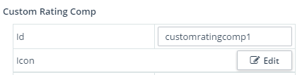
Second, we specify the editorType to be icon and most importantly that it will open in a window dialog using "editorRowType": "window". This is necessary as the icon selection UI is too complex to fit nicely into the property panel.
Here is what it looks like in the property panel:
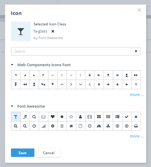
And when we click on the Edit button, we get:
Color Property
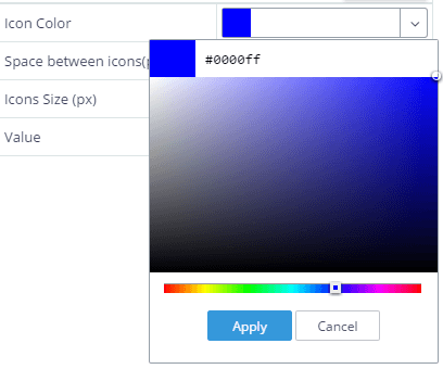
This is a string. When selecting a color we will get something like “#48d3d3”, which we can directly use as a CSS color style.
This property is specified as "editorType": "color", which uses a Kendo UI Color picker widget.
And it looks like this:
Design-Time
As in the earlier post, Introduction to Custom Components for Kendo UI Builder, we define an icon used to show and uniquely identify visually the component in the component palette (Left panel).
We also define a template:
<span>
<% for (i=0; i<value; i++) { %>
<i style="margin-right: <%- spacing %>px;
</i>
<% } %>
</span>
This template simply iterates x amount of times to repeat a font awesome icon.
The icon is styled with the various properties we enter in the designer.
Run-Time
Here we implement a custom component template that encapsulates an Angular rating component. This is the same technique presented in this blog.
In components/custom-rating-comp/angular/config.json.ejs we define all the properties from design time that we want to make use of:
{
"spacing": "<%- spacing %>",
"height": "<%- height %>",
"color": "<%- color %>",
"icon": "<%- icon %>",
"value": "<%- value %>"
}
These properties will be added to the components elements of the $config variable (The generated file name is app/src/app/modules/custom-components/rating/rating.view.base.component.ts)
For example, I have added two instances in my blank view and I have:
public $config: any = {
components: {
customratingcomp0 : {
"spacing": "6",
"height": "25",
"color": "blue",
"icon": "fa fa-star",
"value": "5"
},
customratingcomp1 : {
"spacing": "3",
"height": "15",
"color": "#48d3d3",
"icon": "fa fa-glass",
"value": "5"
}
}};
The template file is straightforward as it essentially passes all properties down to the Angular component. We just have to remember to use the id property to access the specific instance:
<custom-rating
>
</custom-rating>
The Angular Component
It is available at this GitHub directory.
The template is concise:
<span>
<i [ngStyle]="{'color': color, 'margin-right': spacing, 'font-size': height }"
[class]="icon"
*ngFor="let x of loopCounter">
</i>
</span>
We repeat the icon n times using an ngFor construct. We use the designer properties either as a CSS class (for the icon) or as CSS styles (height, color, spacing).
The rating TypeScript component file is simple. The only noticeable thing is that we create a dummy array to use with ngFor as ngFor only works on iterable (it does not accept a simple number).
To use this sample, you need to register the Angular component to the Angular Module system. Add the following code to the generated application source code: app\src\app\shared\shared.module.ts:
import { RatingComponent } from './customcomp/hello-world.component/rating.component';
config.exports.push(RatingComponent);
config.declarations.push(RatingComponent);
Please, follow the same steps described in section “Steps to use Sample” in this blog post.
Conclusion
We have built a rating component that requires no coding at all. It is completely configurable with point and click.
This blog demonstrated it was a relatively easy task. One of the main reasons is that we could leverage the existing icon and color editors in the property panel to make it a breeze to tailor the rating component with any Font Awesome icon. And since these icons are based on SVG technology, we can easily customize their size and color with CSS properties.
This sample uses the rating value entered at design-time to decide how many stars to render. This is fine for a learning sample but not as useful in practice. In a future iteration of this component we will explain how we can hook it up to show the rating value from an object selected in another component on the same page (combo-box). Stay tuned .
Catch Up on Kendo UI Builder
If you jumped into this series in the middle and want to start from the beginning, you can find the previous blog posts here:
Continue reading...
Star rating components are quite popular these days, whether for showing how great a travel destination is or how expensive a restaurant is. Here is a visual example:
In this blog we are going to see how we can easily create such a rating component in our apps with Kendo UI Builder. Here are the parameters of the component we would like to be able to control:
- Icon to show (after all we would like to reuse the same component to show a star rating or a dollar rating)
- Icon color
- Icon size
- Spacing between icons
To follow along, download the template sample zip from github or clone the repository, open folder templates/components/custom-rating-comp-v1/ and follow the instructions outlined in this post to install this template in your target application. The sample is specific to the Angular framework.
As usual, we will look how the component is defined (the component definition file), how it renders at design-time and finally how the run-time portion is implemented.
Component Definition
Open the file components/custom-rating-comp/custom-rating-comp.json
It contains similar properties as the basic component sample, so these should be familiar to you. If not please refer to this blog post.
The new properties we are interested in are:
01.
02.
03.
04.
05.
06.
07.
08.
09.
10.
11.
12.
13.
14.
15.
16.
17.
18.
19.
20.
21.
22.
23.
24.
25.
26.
27.
28.
29.
30.
31.
32.
These are self-describing. There are two property editors we have not encountered yet: icon and color editors. So, let’s expend on these:
Icon Property
First you will notice it’s a string. When we select a font awesome icon we will get a string like “fa fa-star”, which we can directly use as a CSS class as in:
<i class="fa fa-star"></i>.
If you are not familiar with this syntax, please check out fontawesome.
Second, we specify the editorType to be icon and most importantly that it will open in a window dialog using "editorRowType": "window". This is necessary as the icon selection UI is too complex to fit nicely into the property panel.
Here is what it looks like in the property panel:
And when we click on the Edit button, we get:
Color Property
This is a string. When selecting a color we will get something like “#48d3d3”, which we can directly use as a CSS color style.
This property is specified as "editorType": "color", which uses a Kendo UI Color picker widget.
And it looks like this:
Design-Time
As in the earlier post, Introduction to Custom Components for Kendo UI Builder, we define an icon used to show and uniquely identify visually the component in the component palette (Left panel).
We also define a template:
01.
02.
03.
04.
color: <%- color %>;
05.
font-size: <%- height %>px"
06.
class="<%- icon %>">
07.
08.
09.
This template simply iterates x amount of times to repeat a font awesome icon.
The icon is styled with the various properties we enter in the designer.
Run-Time
Here we implement a custom component template that encapsulates an Angular rating component. This is the same technique presented in this blog.
In components/custom-rating-comp/angular/config.json.ejs we define all the properties from design time that we want to make use of:
1.
2.
3.
4.
5.
6.
7.
These properties will be added to the components elements of the $config variable (The generated file name is app/src/app/modules/custom-components/rating/rating.view.base.component.ts)
For example, I have added two instances in my blank view and I have:
01.
02.
03.
04.
05.
06.
07.
08.
09.
10.
11.
12.
13.
14.
15.
16.
17.
The template file is straightforward as it essentially passes all properties down to the Angular component. We just have to remember to use the id property to access the specific instance:
1.
2.
[rating]="$config.components.<%-id%>.value"
3.
[color]="$config.components.<%-id%>.color"
4.
[icon]="$config.components.<%-id%>.icon"
5.
[spacing]="$config.components.<%-id%>.spacing"
6.
[height]="$config.components.<%-id%>.height"
7.
8.
The Angular Component
It is available at this GitHub directory.
The template is concise:
1.
2.
3.
4.
5.
6.
We repeat the icon n times using an ngFor construct. We use the designer properties either as a CSS class (for the icon) or as CSS styles (height, color, spacing).
The rating TypeScript component file is simple. The only noticeable thing is that we create a dummy array to use with ngFor as ngFor only works on iterable (it does not accept a simple number).
To use this sample, you need to register the Angular component to the Angular Module system. Add the following code to the generated application source code: app\src\app\shared\shared.module.ts:
1.
2.
3.
Please, follow the same steps described in section “Steps to use Sample” in this blog post.
Conclusion
We have built a rating component that requires no coding at all. It is completely configurable with point and click.
This blog demonstrated it was a relatively easy task. One of the main reasons is that we could leverage the existing icon and color editors in the property panel to make it a breeze to tailor the rating component with any Font Awesome icon. And since these icons are based on SVG technology, we can easily customize their size and color with CSS properties.
This sample uses the rating value entered at design-time to decide how many stars to render. This is fine for a learning sample but not as useful in practice. In a future iteration of this component we will explain how we can hook it up to show the rating value from an object selected in another component on the same page (combo-box). Stay tuned .
Catch Up on Kendo UI Builder
If you jumped into this series in the middle and want to start from the beginning, you can find the previous blog posts here:
- Introduction to Kendo UI Builder Templates
- Behind the Scenes of Kendo UI Builder Templates
- Event Processing in Kendo UI Builder Templates
- Augmenting Models in Kendo UI Builder Templates
- Introduction to Custom Components for Kendo UI Builder
- Creating Kendo UI Builder Custom Components from Angular Components
Continue reading...