
S
Suzanne Scacca
Guest
Blue is by far the most popular color used by financial institutions, likely because it conveys dependability and professionalism. While you’ll see some blue in these five credit union sites, you’ll also find some really creative and memorable color choices.
An effective website color palette can help a credit union accomplish a number of things.
To start, it will give your organization a distinctive look from other credit union websites. Second, it should help you build credibility and trust with prospective and existing customers. And, lastly, the right color contrast and accent colors can help improve engagement rates.
Now, you have to decide which colors are right for your brand and website.
In this post, we’re going to take a look at five credit union website color palettes, the likely reasons why they chose them and why they’re so effective.
Let’s start with some more traditional color palettes for the financial industry and then work our way out toward standouts in the field:
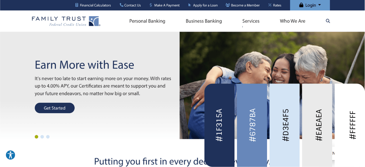
Family Trust Federal Credit Union is about as traditional as they come when it comes to financial color palettes. The logo is built using three shades of blue. These rich yet calming shades of blue suggest that this is a trustworthy and transparent brand.
For the most part, the website’s content resides within large swaths of neutral colors like white and beige. The blue serves as the accent color, drawing attention to key components like the notification bar at the top, call-to-action buttons, clickable icons, content blocks and more.
With the word “trust” built into the name, it’s clear this is the message the credit union wants to reinforce. The blue design elements contribute to this feeling as do the images where the color blue heavily features, like the hero image and the photo at the bottom of the page with employees dressed in dark blue.
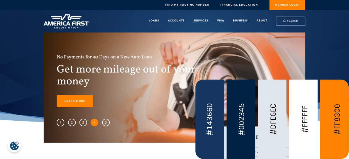
America First Credit Union is a good example of how the interplay of colors can bring a whole new meaning to them.
For starters, the brand’s primary colors are a rich set of blues. However, they’re typically not used as solids. The darker and lighter shades of blue appear as gradients as well as color bands that weave in and out and around one another.
While the color choice suggests this brand is professional and dependable, the way the colors are used also suggests that this brand is fluid and adaptable. This should appeal to people looking for credit unions that are modern and remain on the cutting-edge when it comes to products and benefits.
The orange accent color plays into this theme as well. Orange can mean a number of things, but in this context, it suggests that the credit union is a confident innovator.
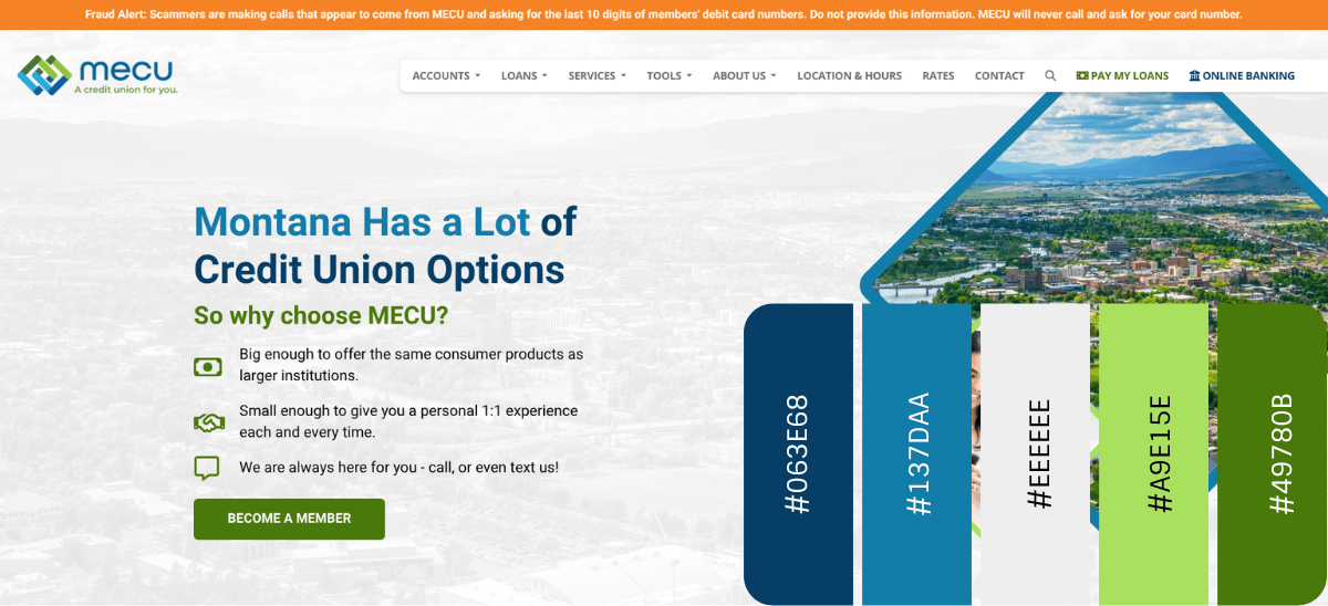
MECU is an interesting example. The color palette is pretty standard for credit unions if we talk about them at a high level. The majority of the site uses neutral background tones. On top of it are shapes, icons and text layers in blue and green.
One of the reasons why this color palette differs from others is because of the variety of hues used. We see a mix of deeper, more conservative blues and greens alongside brighter and more invigorating shades.
This suggests that MECU is a credit union for everyone. We also see this message reinforced through the website imagery. We see younger and older customers as well as people in urban and natural settings.
Another reason this palette stands out is because it doesn’t just seem to represent the brand and its users. It seems to have been inspired by the land of Montana itself. Throughout the website (in the background and foreground) are images of rural lands around the state.
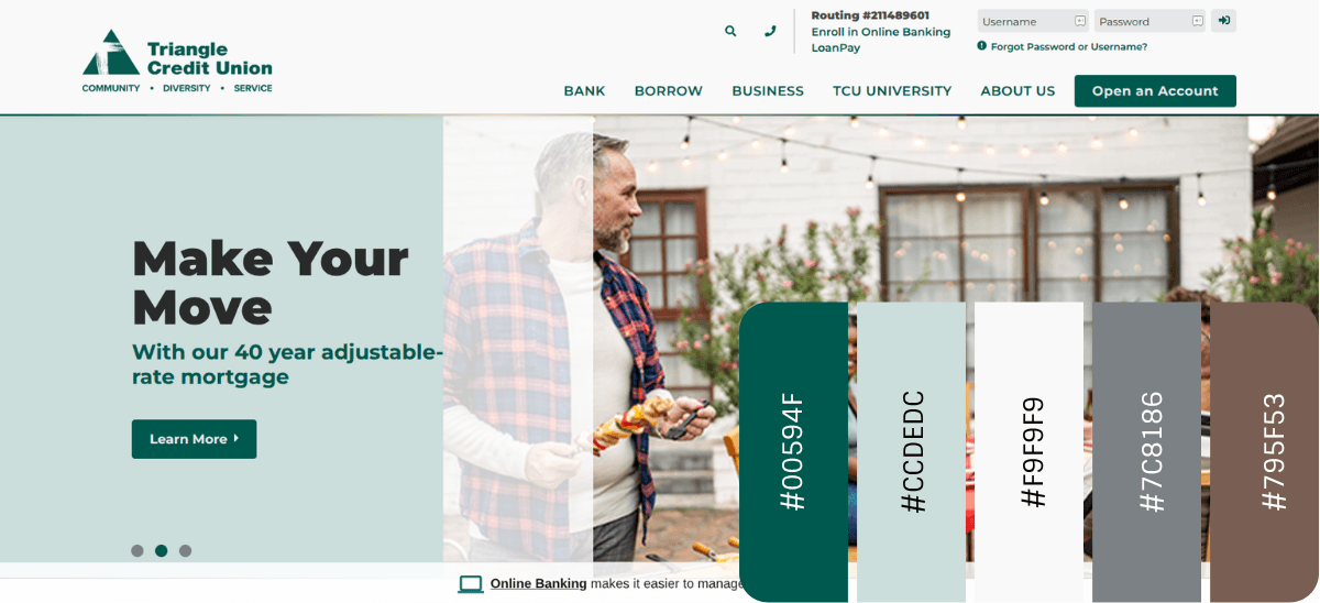
Triangle Credit Union combines nature-green shades with neutral off-white tones. The light and dark forest greens used here suggest themes of nature and growth. This website color palette feels very nurturing.
It seems to be a very intentional choice, especially when you look at the palette alongside the images found throughout the homepage. Many of the photos depict people in natural settings and/or gathering with loved ones.
Typically, I don’t include imagery when piecing together a color palette. However, in this case, I think it applies. Technically, the only colors in the design are the greens, whites and grays. However, the images appear to be carefully curated to include other natural tones, especially browns and tans.
My guess is the “Community” piece of their “Community – Diversity – Service” motto was part of the inspiration for this color palette. I’m guessing that the natural beauty of the city of Nashua played a role in the palette choice as well.
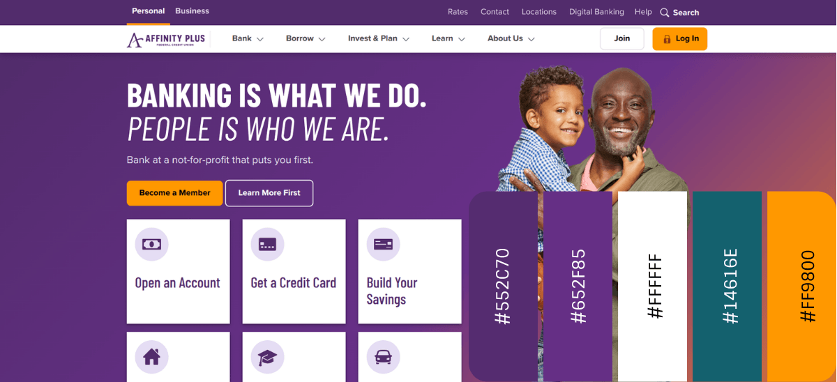
Affinity Plus Federal Credit Union has a really unique and memorable color palette. For starters, purple is the organization’s primary color. According to Straits Research, only 0.8% of the world’s top brands use purple, so this is a bold decision.
Purple has long been tied to the idea of royalty and luxury. However, this particular shade and the usage of it in gradients and surrounded by pale purple tones suggests it means something else here. I would guess this purple is meant to play up the themes of knowledge and depth. In other words, Affinity Plus is a knowledgeable banking partner you can trust.
At the same time, the website utilizes accents of bright orange and an emerald green to call attention to buttons, key sections and the chatbot. Each of these colors blend with the purple—the orange in the hero section and the green in the final section on the homepage.
These bursts of color give the credit union a feeling of optimism and vitality. They suggest that the company is innovative and able to find creative solutions for their customers’ problems.
Before you begin to piece together your own color palette, make sure you have a good understanding of your brand’s mission, vision statement and values. Once you know what it stands for, its key differentiators and how you want it to be perceived, you’ll have an easier time choosing the primary colors for your brand.
Knowing who your user personas are will also come handy at this stage. By getting inside the minds and motivations of your target users, it’ll give you a good idea for the kinds of colors that will appeal to them in this particular context.
In the end, your palette should be one that’s aesthetically pleasing, harmonious and accessible. If you’re not sure how to start, use the examples above as a starting place, play around with different shades of the primary colors and experiment with unique accent colors of your own.
What every credit union should look for in a modern CMS.
Continue reading...
An effective website color palette can help a credit union accomplish a number of things.
To start, it will give your organization a distinctive look from other credit union websites. Second, it should help you build credibility and trust with prospective and existing customers. And, lastly, the right color contrast and accent colors can help improve engagement rates.
Now, you have to decide which colors are right for your brand and website.
In this post, we’re going to take a look at five credit union website color palettes, the likely reasons why they chose them and why they’re so effective.
5 Examples of Effective Credit Union Color Palettes
Let’s start with some more traditional color palettes for the financial industry and then work our way out toward standouts in the field:
Family Trust Federal Credit Union (Neutrals & Blue Accents)
Family Trust Federal Credit Union is about as traditional as they come when it comes to financial color palettes. The logo is built using three shades of blue. These rich yet calming shades of blue suggest that this is a trustworthy and transparent brand.
For the most part, the website’s content resides within large swaths of neutral colors like white and beige. The blue serves as the accent color, drawing attention to key components like the notification bar at the top, call-to-action buttons, clickable icons, content blocks and more.
With the word “trust” built into the name, it’s clear this is the message the credit union wants to reinforce. The blue design elements contribute to this feeling as do the images where the color blue heavily features, like the hero image and the photo at the bottom of the page with employees dressed in dark blue.
America First Credit Union (Deep Blues & Orange Accent)
America First Credit Union is a good example of how the interplay of colors can bring a whole new meaning to them.
For starters, the brand’s primary colors are a rich set of blues. However, they’re typically not used as solids. The darker and lighter shades of blue appear as gradients as well as color bands that weave in and out and around one another.
While the color choice suggests this brand is professional and dependable, the way the colors are used also suggests that this brand is fluid and adaptable. This should appeal to people looking for credit unions that are modern and remain on the cutting-edge when it comes to products and benefits.
The orange accent color plays into this theme as well. Orange can mean a number of things, but in this context, it suggests that the credit union is a confident innovator.
Montana Educators’ Credit Union (Neutrals with Vibrant Blues & Greens)
MECU is an interesting example. The color palette is pretty standard for credit unions if we talk about them at a high level. The majority of the site uses neutral background tones. On top of it are shapes, icons and text layers in blue and green.
One of the reasons why this color palette differs from others is because of the variety of hues used. We see a mix of deeper, more conservative blues and greens alongside brighter and more invigorating shades.
This suggests that MECU is a credit union for everyone. We also see this message reinforced through the website imagery. We see younger and older customers as well as people in urban and natural settings.
Another reason this palette stands out is because it doesn’t just seem to represent the brand and its users. It seems to have been inspired by the land of Montana itself. Throughout the website (in the background and foreground) are images of rural lands around the state.
Triangle Credit Union (Shades of Green with Neutrals)
Triangle Credit Union combines nature-green shades with neutral off-white tones. The light and dark forest greens used here suggest themes of nature and growth. This website color palette feels very nurturing.
It seems to be a very intentional choice, especially when you look at the palette alongside the images found throughout the homepage. Many of the photos depict people in natural settings and/or gathering with loved ones.
Typically, I don’t include imagery when piecing together a color palette. However, in this case, I think it applies. Technically, the only colors in the design are the greens, whites and grays. However, the images appear to be carefully curated to include other natural tones, especially browns and tans.
My guess is the “Community” piece of their “Community – Diversity – Service” motto was part of the inspiration for this color palette. I’m guessing that the natural beauty of the city of Nashua played a role in the palette choice as well.
Affinity Plus Federal Credit Union (Purple with Green and Orange Accents)
Affinity Plus Federal Credit Union has a really unique and memorable color palette. For starters, purple is the organization’s primary color. According to Straits Research, only 0.8% of the world’s top brands use purple, so this is a bold decision.
Purple has long been tied to the idea of royalty and luxury. However, this particular shade and the usage of it in gradients and surrounded by pale purple tones suggests it means something else here. I would guess this purple is meant to play up the themes of knowledge and depth. In other words, Affinity Plus is a knowledgeable banking partner you can trust.
At the same time, the website utilizes accents of bright orange and an emerald green to call attention to buttons, key sections and the chatbot. Each of these colors blend with the purple—the orange in the hero section and the green in the final section on the homepage.
These bursts of color give the credit union a feeling of optimism and vitality. They suggest that the company is innovative and able to find creative solutions for their customers’ problems.
Wrapping Up
Before you begin to piece together your own color palette, make sure you have a good understanding of your brand’s mission, vision statement and values. Once you know what it stands for, its key differentiators and how you want it to be perceived, you’ll have an easier time choosing the primary colors for your brand.
Knowing who your user personas are will also come handy at this stage. By getting inside the minds and motivations of your target users, it’ll give you a good idea for the kinds of colors that will appeal to them in this particular context.
In the end, your palette should be one that’s aesthetically pleasing, harmonious and accessible. If you’re not sure how to start, use the examples above as a starting place, play around with different shades of the primary colors and experiment with unique accent colors of your own.
Modernizing Your Credit Union’s Digital Experience
What every credit union should look for in a modern CMS.
Continue reading...