
T
Thierry Ciot
Guest
Arranging items in cards, rather than a grid, can be an elegant and more mobile-friendly way to display data in your app and engage your users. Learn how you can use the new custom card list view in Kendo UI Builder.
We're always working on making Kendo UI Builder the best tool it can be to help you build great apps quickly, and we're excited to debut our latest improvement. In this post, we present to your our newly released custom view that renders records as a card list view, rather than a grid view. In a card list view, cards are placed next to each other on the page and some of the data shown in grid columns is used to fill the content of a card.
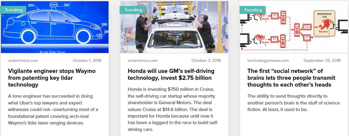
Below is an example of the card list view in action.
Card List View
There are many advantages to rendering content as cards:
There are some disadvantages: a grid is more compact and thus allows you to render more data. Also, some users are accustomed to sorting and/or grouping by columns to quickly find specific records.
Three Custom Card Types
The newly released custom view is called “card-images.” It lets you design cards that contain an image and some text in any of three styles. It is available on github here.
If you want to follow along, the sample data used for these examples is available here as JSON data (See object literal "destinations"). Also, if you have not already done so, you can follow the instructions from this blog (see the section on Setting Up the REST Server) to install a JSON REST server in just two minutes.
The card-images custom view currently provides three card types:
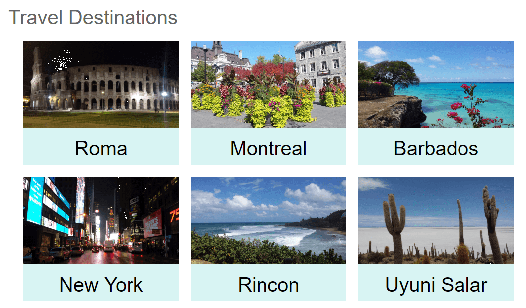
The “Image and Name” is the simplest card. It allows you to create a list that looks like this:
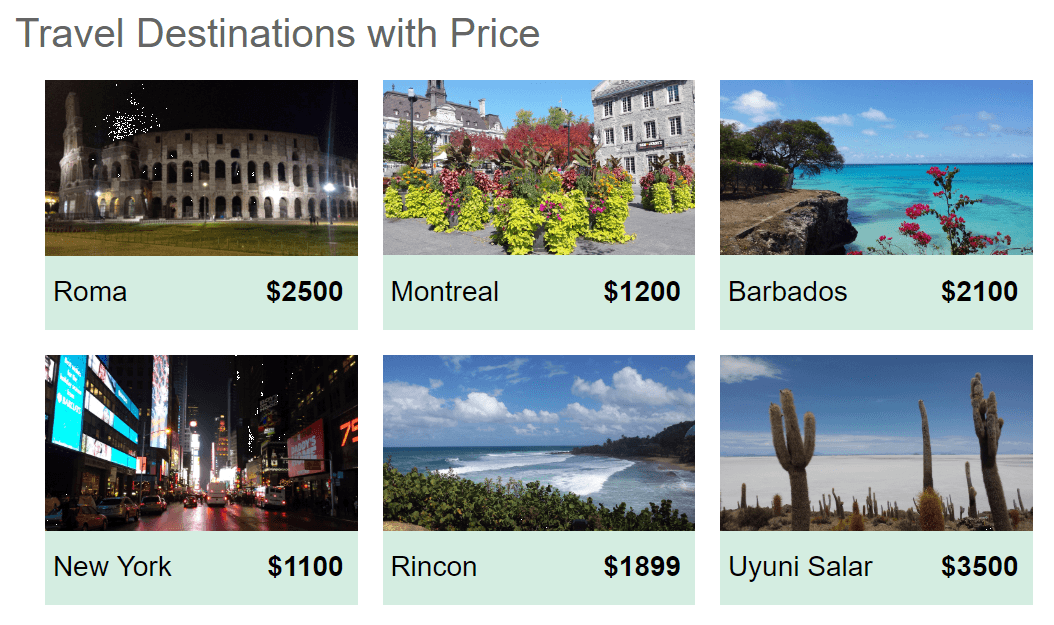
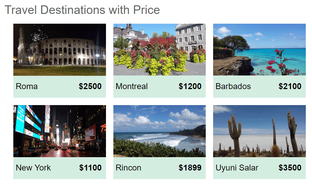
Image, Price and Name
The “Image, price and name” is the first example we saw. It shows the name and the price on the same row:
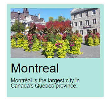
Image, Name and Description
The card for “Image, name and description” looks like this:
Using cards with images in this way is a very common pattern. For example, Firefox pocket shows article summaries like this:
With this new cards list custom view for Kendo UI Builder, you can now easily take advantage of this styling too.
How to Use the Card-Images Custom View
The card image view can be configured with point-and-click properties. The following section describes these properties.
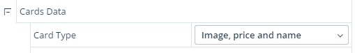
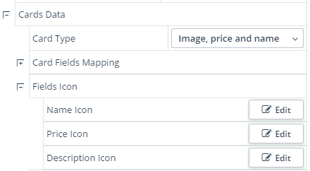
First, you will configure a data source and a data provider. Once done, you will see the list of data source field names. These are the fields you can use to place content from your REST service in the card. For example, with my REST service I get:
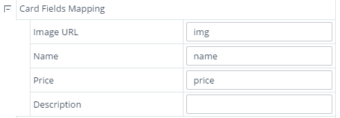
You will then select which type of cards to use. For this example, we use:
Next, we map the data source fields to items in the card:
As soon as we map some fields the card shows sample data in the designer canvas, giving us a feel for how the card and the card list will look. 10 cards are shown by default.
Note that we've left the description field empty, as this card does not use that field. If we were to map a field there anyway, it would not have any impact.
At this point we can already generate the view and get the card list view rendering.
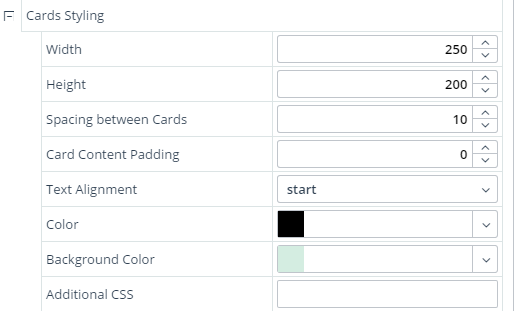
We can improve the styling by adjusting various properties. In my case, I adjusted the card height and width, the spacing between cards and the assorted colors like this:
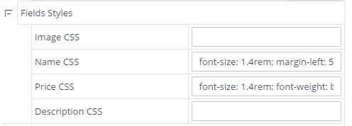
Finally, to render the price in bold and to make both the price and name more readable, I used CSS styling to adjust the font size and weight like this:
Name CSS: font-size: 1.4rem; margin-left: 5px;
Price CSS: font-size: 1.4rem; font-weight: bold; margin-right: 10px;
You can also set an icon as a prefix to the name, price or description using these designer properties:
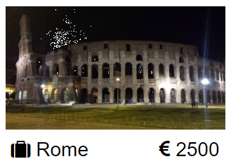
And here is an example card in which we've selected a suitcase icon for the name field, and a Euro currency icon for the price field:
Explore and Extend this Sample
I hope you will find this custom view useful as you explore Kendo UI Builder. Please feel free to extend it for your own company’s needs or use it as a starting point for your own custom views—the complete source code is available here.
Catch Up on Kendo UI Builder
I've written a number of tutorials and guide explaining many of the features of Kendo UI Builder, starting with the Introduction to Kendo UI Builder Templates. You can browse all my latest articles on the topic right here.
Continue reading...
We're always working on making Kendo UI Builder the best tool it can be to help you build great apps quickly, and we're excited to debut our latest improvement. In this post, we present to your our newly released custom view that renders records as a card list view, rather than a grid view. In a card list view, cards are placed next to each other on the page and some of the data shown in grid columns is used to fill the content of a card.
Below is an example of the card list view in action.
Card List View
There are many advantages to rendering content as cards:
- They are responsive, making it easier to adapt to various screen widths.
- They work well on mobile devices. A user does not expect to see a grid on most mobile devices.
- Users can more easily scan for what they are looking for (people usually do not read a web page but scan quickly for relevant information)
- Cards can show pictures in a more relevant fashion because they provide more space from them than a grid row. This facilitates quick content scanning and, just as important, makes it visually pleasing. In other words, a set of cards is less intimidating than a set of rows.
- It's easier to summarize what’s important to show in each record. The card typically only shows a few fields and give more visual design choices to the creator than a grid row.
There are some disadvantages: a grid is more compact and thus allows you to render more data. Also, some users are accustomed to sorting and/or grouping by columns to quickly find specific records.
Three Custom Card Types
The newly released custom view is called “card-images.” It lets you design cards that contain an image and some text in any of three styles. It is available on github here.
If you want to follow along, the sample data used for these examples is available here as JSON data (See object literal "destinations"). Also, if you have not already done so, you can follow the instructions from this blog (see the section on Setting Up the REST Server) to install a JSON REST server in just two minutes.
The card-images custom view currently provides three card types:
- Image and Name
- Image, price and name
- Image, name and description
The “Image and Name” is the simplest card. It allows you to create a list that looks like this:
Image, Price and Name
The “Image, price and name” is the first example we saw. It shows the name and the price on the same row:
Image, Name and Description
The card for “Image, name and description” looks like this:
Using cards with images in this way is a very common pattern. For example, Firefox pocket shows article summaries like this:
With this new cards list custom view for Kendo UI Builder, you can now easily take advantage of this styling too.
How to Use the Card-Images Custom View
The card image view can be configured with point-and-click properties. The following section describes these properties.
First, you will configure a data source and a data provider. Once done, you will see the list of data source field names. These are the fields you can use to place content from your REST service in the card. For example, with my REST service I get:
You will then select which type of cards to use. For this example, we use:
Next, we map the data source fields to items in the card:
As soon as we map some fields the card shows sample data in the designer canvas, giving us a feel for how the card and the card list will look. 10 cards are shown by default.
Note that we've left the description field empty, as this card does not use that field. If we were to map a field there anyway, it would not have any impact.
At this point we can already generate the view and get the card list view rendering.
We can improve the styling by adjusting various properties. In my case, I adjusted the card height and width, the spacing between cards and the assorted colors like this:
Finally, to render the price in bold and to make both the price and name more readable, I used CSS styling to adjust the font size and weight like this:
Name CSS: font-size: 1.4rem; margin-left: 5px;
Price CSS: font-size: 1.4rem; font-weight: bold; margin-right: 10px;
You can also set an icon as a prefix to the name, price or description using these designer properties:
And here is an example card in which we've selected a suitcase icon for the name field, and a Euro currency icon for the price field:
Explore and Extend this Sample
I hope you will find this custom view useful as you explore Kendo UI Builder. Please feel free to extend it for your own company’s needs or use it as a starting point for your own custom views—the complete source code is available here.
Catch Up on Kendo UI Builder
I've written a number of tutorials and guide explaining many of the features of Kendo UI Builder, starting with the Introduction to Kendo UI Builder Templates. You can browse all my latest articles on the topic right here.
Continue reading...