
S
Suzanne Scacca
Guest
This year, we’re seeing a ton of creative choices when it comes to typography in web design. In this post, we’re going to look closely at four trends that are popular right now, including lowercase headings, dainty details, maximalism and illogical italics.
The typography trends we’re seeing right now are really interesting. We’ve got everything from maximalist typography that takes up the full width and length of the screen to very dainty details that are almost too hard to read.
Let’s take a look at four current typography trends, why they’re popular right now and some examples that demonstrate different ways to achieve these effects.
The lowercase heading trend isn’t super pervasive, but it is one that we’re seeing a variety of brands adopt.
For example, Starface World is a company that sells pimple patches. Here is what their hero section looks like:
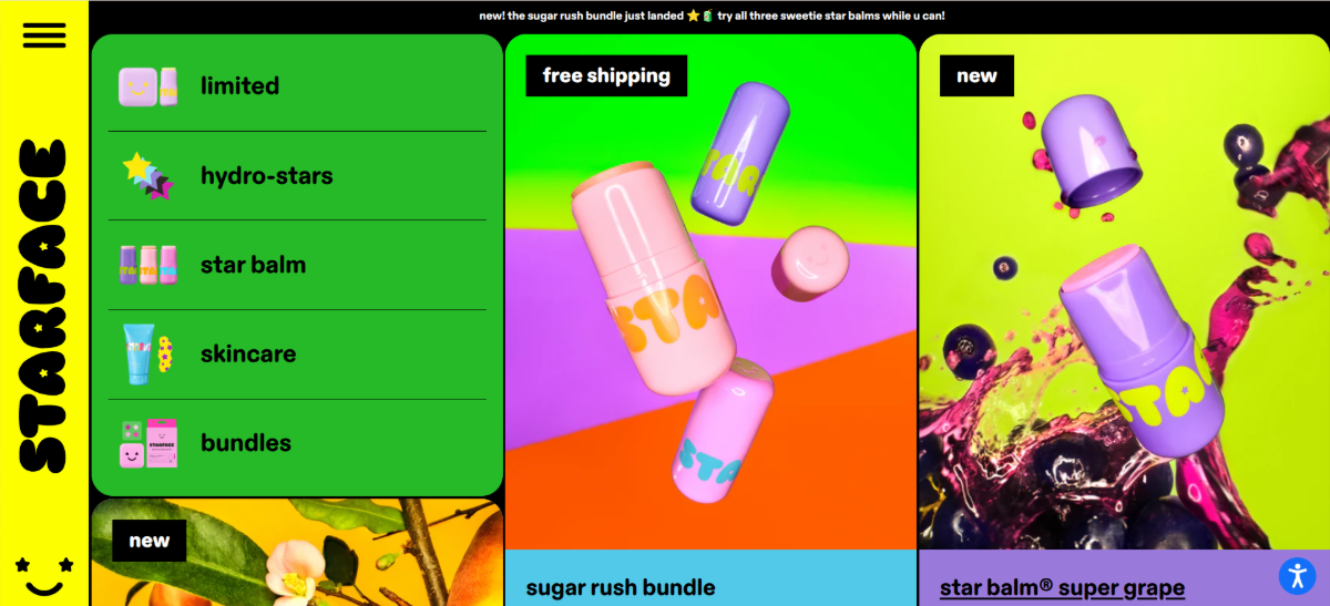
You can see that product names (e.g., sugar rush bundle), categories (e.g., skincare, limited) and labels (e.g., free shipping, new) are all in lowercase text.
Why would a brand do this with its typography? Wouldn’t all lowercase headings and labels come off as feeling low effort?
A recent study found that all uppercase text makes a brand seem more competent. However, the flipside of that isn’t necessarily true—i.e., that all lowercase text suggests incompetence.
Instead, a study looking at lowercase lettering found that it gives brands the perception of warmth. I’d argue that there are other positive characteristics that consumers might associate with lowercase lettering, like:
Lowercase lettering is actually quite popular with the Gen Z crowd.
Digge Zetterberg, the CMO at Frontify, explained why:
Thinx is another brand that’s adopted the lowercase heading approach:
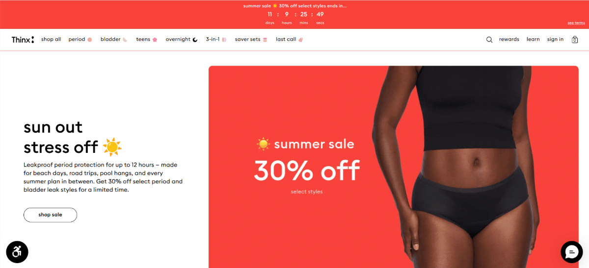
In addition to lowercase headings, it’s also applied to promo text, navigation labels and buttons.
It makes sense for brands with novel and disruptive products like Thinx to go the route of lowercase typography. The stylizing of their messaging like this feels more conversational and relatable.
Maison is a digital agency that’s hopped on the lowercase bandwagon as well:
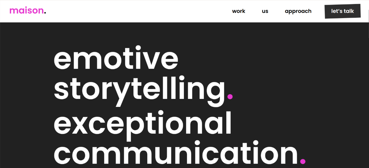
Unlike the other two examples, though, they’ve paired lowercase headings with maximalism (more on that below) for an interesting effect. Instead of exuding the warmth and friendliness we feel in the other examples, this one seems to be all about embracing modernity and shrugging off tradition.
For many years, I’ve been shouting from the rooftops that the minimum font size that should be used in digital design is 16px. It’s the ideal font size for readability and accessibility. Yet, in 2026, font sizes are shrinking.
Let’s look at our first example from Von Dutch:
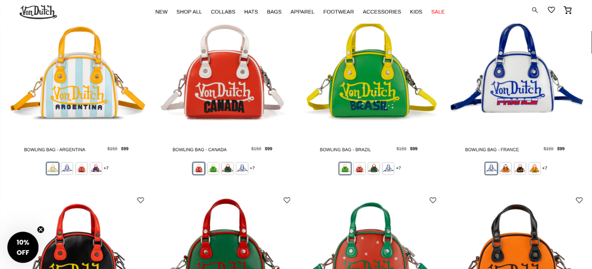
Von Dutch is not what you’d call a quiet or demure brand. You can see it in the product photos above. The brand’s products are colorful and attention-grabbing.
Despite this, notice the fonts that surround them (sans the logo). The font for the navigation labels up top and the product names under the photos is Helvetica. The navigation tabs are 14px and the body text is 12px.
What’s going on here? Is this a way for brands to signal that they’re Gen Z-friendly (as younger eyes are going to have the easiest time reading dainty text)?
I wasn’t so sure. Von Dutch, for example, is a brand from my generation (the Xennnials). I was born in ’83 and this company was super popular when I was in college. However, after doing some online sleuthing, it looks like the heads of the company are going after a younger market:
I don’t think a Gen Z target market is the only reason for the bite-sized typography though. Von Dutch claims that its company was built around “rebellion, individuality, and cultural disruption.” So the adopting of this trend could be a way of rebelling against what’s been the norm for so long.
Willy Chavarria is another example of a Gen Z-friendly brand that’s leaning into the dainty text trend:
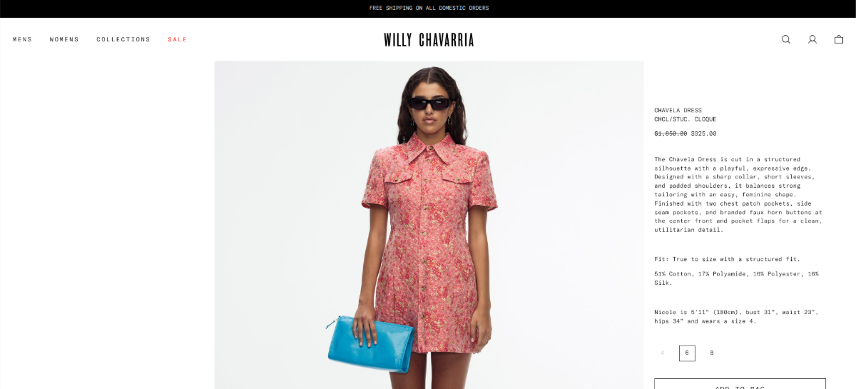
Again, here we see an ecommerce site with very small and thin lettering used for the navigation and product info. The font used here is called GT America Mono Lt. The product text is 12px and the navigation labels 14px.
Considering the youthfulness of this brand, is the typography choice simply a matter of rejecting tradition? It could be. That said, it’s a trend I’ve seen a lot in ecommerce lately, even from much older brands like Polaroid:
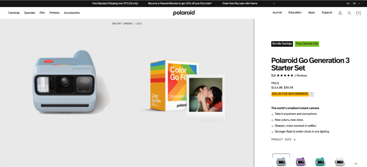
This example is a bit different than the other two because we do see some hierarchy in terms of font size and letter styling/thickness. At the same time, it’s hard to ignore how teeny-tiny the product description and metadata are.
What’s interesting about this typography trend is it reminds me of Balenciaga’s branding. This company has been at the forefront of brutalist web design for years.
So perhaps that’s another driver of this trend. As the world becomes ever more expensive and exclusive-feeling, companies are taking a scaled-back approach to design and typography. They don’t want to wow visitors with the decoration of their websites or content. They want to save it for the luxury products they purchase from them.
While some brands are going super itsy-bitsy with their typography, others are swinging to the opposite end of the spectrum with maximalist type.
Here’s an example of an oversized typographic hero section from Hourly App:
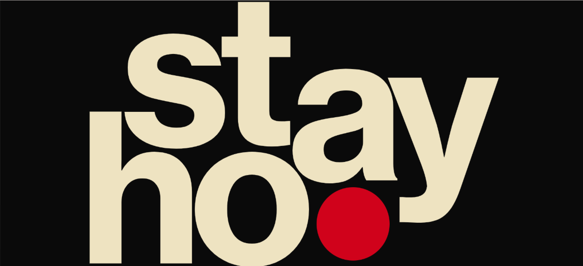
This is the first thing visitors see when they enter the website. There is no logo or navigation—just this lopsided and incomplete heading. To reveal the whole message, visitors have to scroll. When they do, they’ll see that it says “stay home.”
This is an app to help with reducing distractions and time management. So this maximalist typography is the perfect choice for capturing the attention of users who need the help.
With so many websites looking like clones of one another, this one stands out, no question. But this isn’t the only way to use maximalism to get attention.
Here’s an example from FUAI Sucks:
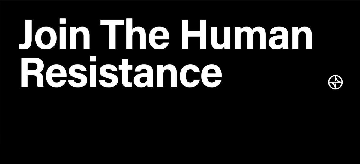
This is not the hero section on the website. This appears just below the fold. With an eye-catching, slide-in transition effect, large white lettering and lots of white (black) space, this section is going to be a difficult one to scroll on by.
This is a good example of how maximalist typography doesn’t necessarily need to fill or push past the boundaries of the screen. It just needs to be powerful enough to make people stop and notice. So, to make this work, you’ll need a very distinctive color contrast and good use of space.
Heinz is another brand going the route of maximalism:
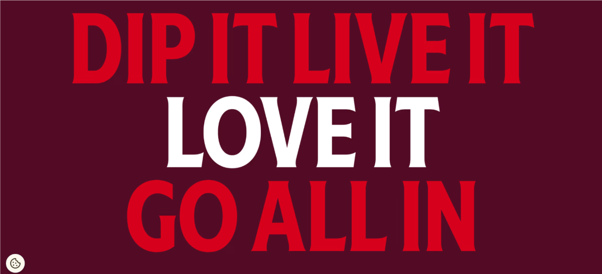
What I like about these last two examples is that neither appear in the hero section. We expect the heroes to be large and in charge, but not necessarily anything else on the homepage.
Yet, these brands are using maximalist typography to draw attention to impactful messages lower on the homescreen. If you find through heatmaps or session recordings that people are missing important messaging below the fold, maximalism could be the trick to resolving that issue.
This final typography trend is another one that has me scratching my head as a writer and designer. Regardless, it’s a trend I’ve seen in so many places, it’s one we need to examine.
This is one I call “illogical italics.”
Let’s start with Side Studios:
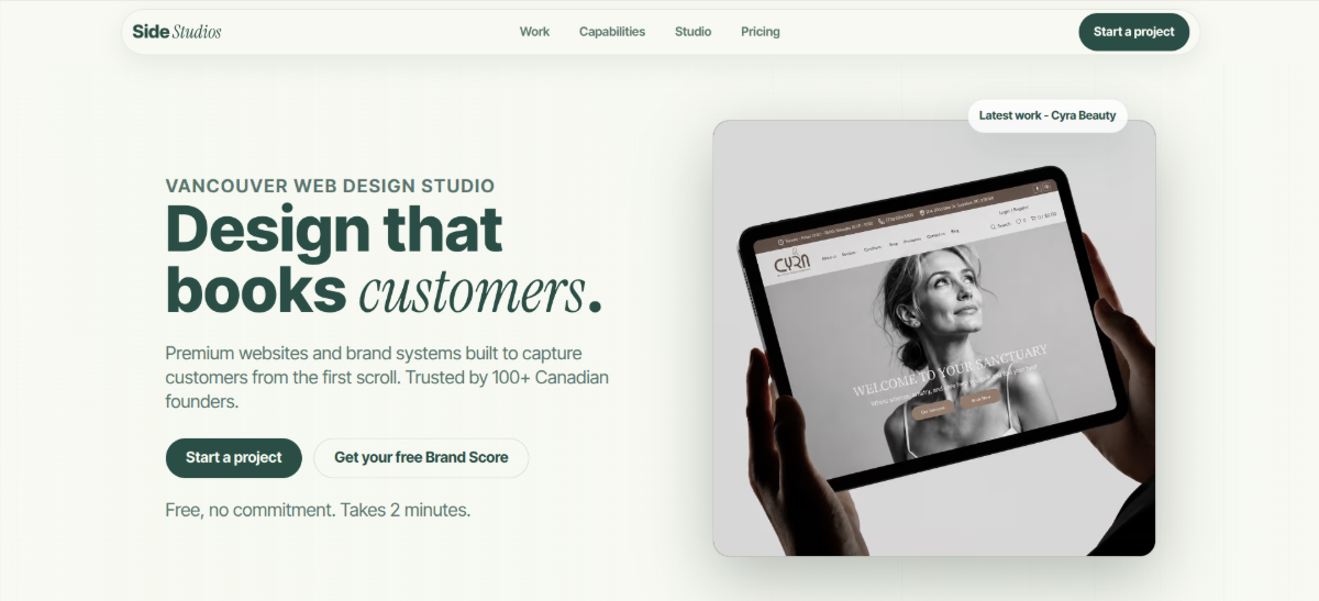
As you scroll down this homepage, you’ll find that each of the headings has italics at the end of it:
The logo also uses the same italicization on the final word—Side Studios.
We typically use italics to put a vocal emphasis on certain words. (We can also use them for scientific terminology and foreign words.) In some of these heading examples, I think the emphasis makes sense. But in the others? Not so much.
So, why italicize at all? For Side Studios, I think it’s just a stylistic choice. Whereas we used to see lots of brands apply color to random words, it appears they’re now doing this with italics. I think as long as they maintain consistency in where the italics go as Side Studios does, it’s a typography trend that can work.
Another way I see illogical italic usage working is if the brand wants to lean into the idea of chaos. And a great example of this is Cards Against Humanity’s Climate Catastrophe Pack:
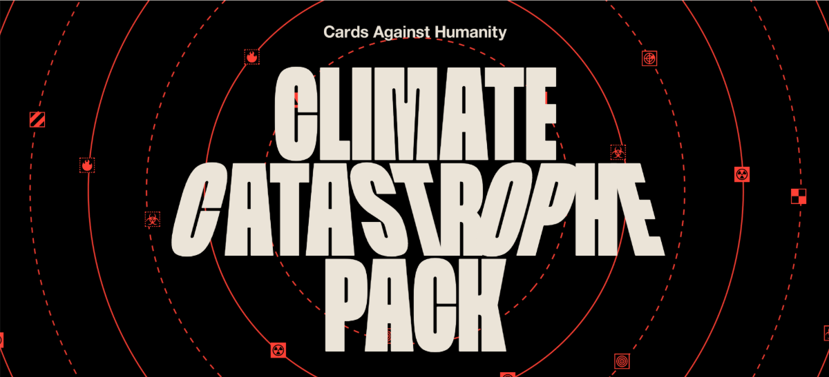
This game is all about the world in chaos, so it makes complete sense that the typography stylization would be chaotic. In the word “Catastrophe” we see two types of italics. The “c” and “op” are regular italics that lean to the right. The “st,” however, leans to the left.
There’s no reason to italicize any of these letters for vocal emphasis. And there’s no real meaning for letters that are italicized in the opposing direction. So, again, this is another example of a designer (or maybe the writer) using italics for stylistic purposes.
Lessons of Design is another brand that’s using italics for aesthetic purposes:
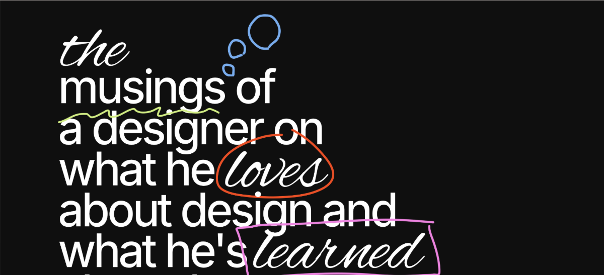
There are three words here that are italicized—“the,” “loves” and “learned.” Technically, “musings” is too, as the squiggle underneath is a symbol we use in editing to apply italics to plain text.
As for why designers and writers are applying italics to words that don’t require vocal emphasis, it’s definitely a stylistic choice. I think this also plays into the overarching theme we’ve seen with the other trends of rejecting traditionalism and embracing modernity. So long as these illogical italics don’t cause confusion or annoyance for users, I see no harm in using them.
Typography is usually the place where we consistently play it safe in web design. In order to keep content readable and accessible, reliable fonts and formatting choices are often used. However, as these typography trends demonstrate, there are fun and modern ways to experiment with typography these days. What’s more, they can tell your users a lot about your brand and what it stands for before they even read the text.
What’s been your experience with these trends? If you haven’t had any yet, will you considering trying them out in the coming year?
Imagery plays an important role in establishing the look, personality and even trustworthiness of a brand. But with so many tools out there to help you curate or create imagery, where do you start? These three steps can help you find the right graphics for your brand.
Continue reading...
The typography trends we’re seeing right now are really interesting. We’ve got everything from maximalist typography that takes up the full width and length of the screen to very dainty details that are almost too hard to read.
Let’s take a look at four current typography trends, why they’re popular right now and some examples that demonstrate different ways to achieve these effects.
Lowercase Headings
The lowercase heading trend isn’t super pervasive, but it is one that we’re seeing a variety of brands adopt.
For example, Starface World is a company that sells pimple patches. Here is what their hero section looks like:
You can see that product names (e.g., sugar rush bundle), categories (e.g., skincare, limited) and labels (e.g., free shipping, new) are all in lowercase text.
Why would a brand do this with its typography? Wouldn’t all lowercase headings and labels come off as feeling low effort?
A recent study found that all uppercase text makes a brand seem more competent. However, the flipside of that isn’t necessarily true—i.e., that all lowercase text suggests incompetence.
Instead, a study looking at lowercase lettering found that it gives brands the perception of warmth. I’d argue that there are other positive characteristics that consumers might associate with lowercase lettering, like:
- Youthfulness
- Friendliness
- Simplicity
- Modernity (as it’s reminiscent of texting)
- Relatability
Lowercase lettering is actually quite popular with the Gen Z crowd.
Digge Zetterberg, the CMO at Frontify, explained why:
“Gen Z’s preference for lowercase letters is a small, deliberate rejection of traditional norms, signalling a more casual tone. This resembles a ‘stream of consciousness’ rather than a polished, edited message, enhancing the sense of authenticity.”
Thinx is another brand that’s adopted the lowercase heading approach:
In addition to lowercase headings, it’s also applied to promo text, navigation labels and buttons.
It makes sense for brands with novel and disruptive products like Thinx to go the route of lowercase typography. The stylizing of their messaging like this feels more conversational and relatable.
Maison is a digital agency that’s hopped on the lowercase bandwagon as well:
Unlike the other two examples, though, they’ve paired lowercase headings with maximalism (more on that below) for an interesting effect. Instead of exuding the warmth and friendliness we feel in the other examples, this one seems to be all about embracing modernity and shrugging off tradition.
Dainty Details
For many years, I’ve been shouting from the rooftops that the minimum font size that should be used in digital design is 16px. It’s the ideal font size for readability and accessibility. Yet, in 2026, font sizes are shrinking.
Let’s look at our first example from Von Dutch:
Von Dutch is not what you’d call a quiet or demure brand. You can see it in the product photos above. The brand’s products are colorful and attention-grabbing.
Despite this, notice the fonts that surround them (sans the logo). The font for the navigation labels up top and the product names under the photos is Helvetica. The navigation tabs are 14px and the body text is 12px.
What’s going on here? Is this a way for brands to signal that they’re Gen Z-friendly (as younger eyes are going to have the easiest time reading dainty text)?
I wasn’t so sure. Von Dutch, for example, is a brand from my generation (the Xennnials). I was born in ’83 and this company was super popular when I was in college. However, after doing some online sleuthing, it looks like the heads of the company are going after a younger market:
“Our efforts include deepening the storytelling around the brand to resonate with both former and new, younger fans, and reorganizing the business in the U.S. to support and strengthen our existing international operations. Our target customers value bold self-expression and a sense of belonging within a vibrant culture.”
I don’t think a Gen Z target market is the only reason for the bite-sized typography though. Von Dutch claims that its company was built around “rebellion, individuality, and cultural disruption.” So the adopting of this trend could be a way of rebelling against what’s been the norm for so long.
Willy Chavarria is another example of a Gen Z-friendly brand that’s leaning into the dainty text trend:
Again, here we see an ecommerce site with very small and thin lettering used for the navigation and product info. The font used here is called GT America Mono Lt. The product text is 12px and the navigation labels 14px.
Considering the youthfulness of this brand, is the typography choice simply a matter of rejecting tradition? It could be. That said, it’s a trend I’ve seen a lot in ecommerce lately, even from much older brands like Polaroid:
This example is a bit different than the other two because we do see some hierarchy in terms of font size and letter styling/thickness. At the same time, it’s hard to ignore how teeny-tiny the product description and metadata are.
What’s interesting about this typography trend is it reminds me of Balenciaga’s branding. This company has been at the forefront of brutalist web design for years.
So perhaps that’s another driver of this trend. As the world becomes ever more expensive and exclusive-feeling, companies are taking a scaled-back approach to design and typography. They don’t want to wow visitors with the decoration of their websites or content. They want to save it for the luxury products they purchase from them.
Maximalism
While some brands are going super itsy-bitsy with their typography, others are swinging to the opposite end of the spectrum with maximalist type.
Here’s an example of an oversized typographic hero section from Hourly App:
This is the first thing visitors see when they enter the website. There is no logo or navigation—just this lopsided and incomplete heading. To reveal the whole message, visitors have to scroll. When they do, they’ll see that it says “stay home.”
This is an app to help with reducing distractions and time management. So this maximalist typography is the perfect choice for capturing the attention of users who need the help.
With so many websites looking like clones of one another, this one stands out, no question. But this isn’t the only way to use maximalism to get attention.
Here’s an example from FUAI Sucks:
This is not the hero section on the website. This appears just below the fold. With an eye-catching, slide-in transition effect, large white lettering and lots of white (black) space, this section is going to be a difficult one to scroll on by.
This is a good example of how maximalist typography doesn’t necessarily need to fill or push past the boundaries of the screen. It just needs to be powerful enough to make people stop and notice. So, to make this work, you’ll need a very distinctive color contrast and good use of space.
Heinz is another brand going the route of maximalism:
What I like about these last two examples is that neither appear in the hero section. We expect the heroes to be large and in charge, but not necessarily anything else on the homepage.
Yet, these brands are using maximalist typography to draw attention to impactful messages lower on the homescreen. If you find through heatmaps or session recordings that people are missing important messaging below the fold, maximalism could be the trick to resolving that issue.
Illogical Italics
This final typography trend is another one that has me scratching my head as a writer and designer. Regardless, it’s a trend I’ve seen in so many places, it’s one we need to examine.
This is one I call “illogical italics.”
Let’s start with Side Studios:
As you scroll down this homepage, you’ll find that each of the headings has italics at the end of it:
- “Design that books customers.”
- “Four moves. One standard.”
- “Selected work”
- “How we ship”
- “Built end-to-end”
- “Results, not promises.”
- “High-stakes work, handled.”
- “One studio. One engine.”
- “See where your site stands. Free.”
The logo also uses the same italicization on the final word—Side Studios.
We typically use italics to put a vocal emphasis on certain words. (We can also use them for scientific terminology and foreign words.) In some of these heading examples, I think the emphasis makes sense. But in the others? Not so much.
So, why italicize at all? For Side Studios, I think it’s just a stylistic choice. Whereas we used to see lots of brands apply color to random words, it appears they’re now doing this with italics. I think as long as they maintain consistency in where the italics go as Side Studios does, it’s a typography trend that can work.
Another way I see illogical italic usage working is if the brand wants to lean into the idea of chaos. And a great example of this is Cards Against Humanity’s Climate Catastrophe Pack:
This game is all about the world in chaos, so it makes complete sense that the typography stylization would be chaotic. In the word “Catastrophe” we see two types of italics. The “c” and “op” are regular italics that lean to the right. The “st,” however, leans to the left.
There’s no reason to italicize any of these letters for vocal emphasis. And there’s no real meaning for letters that are italicized in the opposing direction. So, again, this is another example of a designer (or maybe the writer) using italics for stylistic purposes.
Lessons of Design is another brand that’s using italics for aesthetic purposes:
There are three words here that are italicized—“the,” “loves” and “learned.” Technically, “musings” is too, as the squiggle underneath is a symbol we use in editing to apply italics to plain text.
As for why designers and writers are applying italics to words that don’t require vocal emphasis, it’s definitely a stylistic choice. I think this also plays into the overarching theme we’ve seen with the other trends of rejecting traditionalism and embracing modernity. So long as these illogical italics don’t cause confusion or annoyance for users, I see no harm in using them.
Wrapping Up
Typography is usually the place where we consistently play it safe in web design. In order to keep content readable and accessible, reliable fonts and formatting choices are often used. However, as these typography trends demonstrate, there are fun and modern ways to experiment with typography these days. What’s more, they can tell your users a lot about your brand and what it stands for before they even read the text.
What’s been your experience with these trends? If you haven’t had any yet, will you considering trying them out in the coming year?
How to Come Up with the Right Style for Your Brand Imagery
Imagery plays an important role in establishing the look, personality and even trustworthiness of a brand. But with so many tools out there to help you curate or create imagery, where do you start? These three steps can help you find the right graphics for your brand.
Continue reading...