
T
Thierry Ciot
Guest
Kendo UI Builder ships with many components, but you may want to create your own custom ones. Read on to learn how to do this in Angular and AngularJS.
In Kendo UI Builder, a component is a widget that you can place on a blank view. Kendo UI Builder already ships with many components out of the box, making it a very rich development environment (for example, charts, calendars, etc.). However, there may come a time when you will want to create custom components for reuse across your Angular or AngularJS projects and applications, or even across your entire organization.
As we did for learning the basics of custom views, we will explore the simplest component possible in the form of a “Hello World” custom component.
To follow along, download the custom-hello-world-comp project zip from github or clone this repository
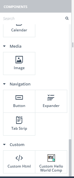
Copy the folder “custom-hello-world-comp” to the folder “template/components” in your target application and restart Kendo UI Builder. Click “Add View,” select a Blank view and you should now see the custom component like in this screenshot (scroll to the bottom of the component panel or search for custom):
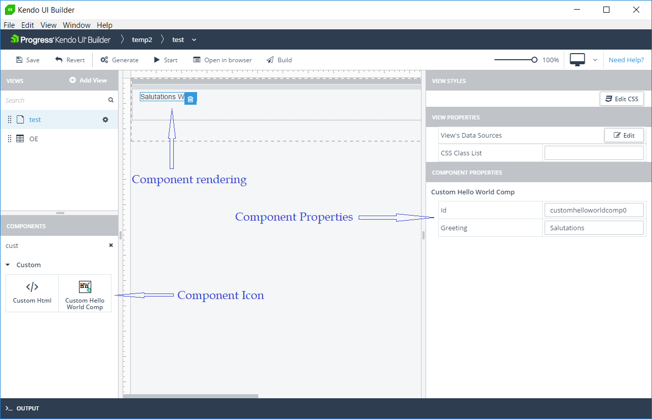
When building a custom component, there are three main items to construct:
Here is a screenshot illustrating where some of these items appear in the designer:
Custom Component Definition File
Open the file custom-hello-world-comp.json.
This file contains a set of fields. The key fields to define are:
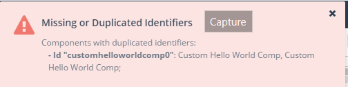
The id property is required and it helps ensure multiple instances of the component can exist on the same page.
Kendo UI Builder will ensure that no two components on the same view have the same id. Here is what you would get if you had duplicated ids:
When we get to the run-time part, we will see how the unique id is also used to define, in the model, properties specific to each instance.
Design-Time Elements
They are located in the sub-directory “design-time.” In this folder we have:
.ejs files are template files. They are executed by Kendo UI Builder to replace the template tags with their actual value. See EJS -- Embedded JavaScript templates for more information.
When you program a custom component, you simply provide a representation of the widget that comes close to the run-time view. However you do not have to implement user interactions as Kendo UI Builder does not pass mouse or keyboard events to the design-time view.
The design goal is to let you focus your time and energy on the rendering of the run-time component.
Run-Time Elements
The content of the run-time files will depend on which target framework is used. In Kendo UI Builder version 2.x, we support the AngularJS framework. Starting in version 3, we will support both AngularJS and Angular 5 frameworks.
Note: Kendo UI Builder version 3 will be available later in May.
AngularJS
The files are in sub-directory “angularjs”:
Options.json.ejs: This is where we define which component properties will get added to the model in the controller of the blank view the component is attached to.
The properties are added to the $components array, indexed by the component unique id. Now we see the importance of the id property in the component definition file. For example, for two instances of a hello world component in the same blank view my controller.js contains:
this.$components['customhelloworldcomp1'] = {
"greeting": "Hi1"
};
this.$components['customhelloworldcomp2'] = {
"greeting": "Hi2"
};
directive.html.ejs: This file contains the HTML that will be rendered at runtime. The items defined in options.json.ejs are available from the component model.
In this EJS template we use the id property to access the specific instance model and from there we access the greeting property. For example:
<span>
{{vm.$components.<%-id%>.greeting}} World
</span>
A property travels from the definition file to the options.json file, then to the blank view controller and finally to the runtime component.
Angular
The files are in sub-directory “angular”:
config.json.ejs: This is where we define which view properties will get added to the components elements of the $config variable.
The properties are added to the components array, indexed by the component unique id. Here again, we see the importance of the id property in the component definition file. For example, for two instances of a hello world component in the same blank view my base.components.ts file contains:
public $config: any = {
components: {
},
};
You will find this file in your generated code under the view sub-folder. For example, my view is called hw-comp under module custom-components. This is where the file is located: app\src\app\modules\custom-components\hw-comp\hw-comp.view.base.component.ts
template.html.ejs: This file contains the HTML that will be rendered at runtime. The items defined in config.json.ejs are available from the component model.
In this EJS template we use the id property to access the specific instance model and from there we access the greeting property. For example:
<span>
{{$config.components.<%-id%>.greeting}} World
</span>
Conclusion
As you can see, creating a custom component has similarity with a custom view. We must take into account that multiple instances of the component can exist in the same view. This is the main reason for having an id property in the definition file.
Also, a component can interact with other components using the model property. For example, a metric component showing the temperature of the room selected in a combo-box component on the same page. In the next blog post, we will look how to create such components. Stay tuned.
If you jumped into this series in the middle and want to start from the beginning, you can find the previous blog posts here:
Continue reading...
In Kendo UI Builder, a component is a widget that you can place on a blank view. Kendo UI Builder already ships with many components out of the box, making it a very rich development environment (for example, charts, calendars, etc.). However, there may come a time when you will want to create custom components for reuse across your Angular or AngularJS projects and applications, or even across your entire organization.
As we did for learning the basics of custom views, we will explore the simplest component possible in the form of a “Hello World” custom component.
To follow along, download the custom-hello-world-comp project zip from github or clone this repository
Copy the folder “custom-hello-world-comp” to the folder “template/components” in your target application and restart Kendo UI Builder. Click “Add View,” select a Blank view and you should now see the custom component like in this screenshot (scroll to the bottom of the component panel or search for custom):
When building a custom component, there are three main items to construct:
- The custom component definition file: A JSON file that describes the Custom Component to Kendo UI Builder
- The design time elements rendered in Kendo UI Builder. These include:
- The icon shown in the component selection palette
- The UI of the component as it renders at design time
- How the component renders and behaves at run-time for the specific target framework (for example, AngularJS or Angular 5); the tasks we typically take care of include:
- Presenting the UI
- Reacting to events
- Interacting with data model
Here is a screenshot illustrating where some of these items appear in the designer:
Custom Component Definition File
Open the file custom-hello-world-comp.json.
This file contains a set of fields. The key fields to define are:
- The name as it appears in the component panel as well as in the property panel
- The list of properties to render in the right-side panel of the designer—in our case, we have defined two properties: id and greeting
The id property is required and it helps ensure multiple instances of the component can exist on the same page.
Kendo UI Builder will ensure that no two components on the same view have the same id. Here is what you would get if you had duplicated ids:
When we get to the run-time part, we will see how the unique id is also used to define, in the model, properties specific to each instance.
Design-Time Elements
They are located in the sub-directory “design-time.” In this folder we have:
- An icon, used in the component palette (left panel).
- options.json.ejs: it is used to augment the model with additional properties not defined in the definition file. These would be properties the user does not edit in the properties panel. In our case, this is an empty object literal as we have no additional properties to provide. See this blog for details on augmenting models
- template.html.ejs: this is where we program the HTML defining how our custom component will render in the Kendo UI Builder main panel. It is parameterized with metadata properties.
.ejs files are template files. They are executed by Kendo UI Builder to replace the template tags with their actual value. See EJS -- Embedded JavaScript templates for more information.
When you program a custom component, you simply provide a representation of the widget that comes close to the run-time view. However you do not have to implement user interactions as Kendo UI Builder does not pass mouse or keyboard events to the design-time view.
The design goal is to let you focus your time and energy on the rendering of the run-time component.
Run-Time Elements
The content of the run-time files will depend on which target framework is used. In Kendo UI Builder version 2.x, we support the AngularJS framework. Starting in version 3, we will support both AngularJS and Angular 5 frameworks.
Note: Kendo UI Builder version 3 will be available later in May.
AngularJS
The files are in sub-directory “angularjs”:
Options.json.ejs: This is where we define which component properties will get added to the model in the controller of the blank view the component is attached to.
The properties are added to the $components array, indexed by the component unique id. Now we see the importance of the id property in the component definition file. For example, for two instances of a hello world component in the same blank view my controller.js contains:
this.$components['customhelloworldcomp1'] = {
"greeting": "Hi1"
};
this.$components['customhelloworldcomp2'] = {
"greeting": "Hi2"
};
directive.html.ejs: This file contains the HTML that will be rendered at runtime. The items defined in options.json.ejs are available from the component model.
In this EJS template we use the id property to access the specific instance model and from there we access the greeting property. For example:
<span>
{{vm.$components.<%-id%>.greeting}} World
</span>
A property travels from the definition file to the options.json file, then to the blank view controller and finally to the runtime component.
Angular
The files are in sub-directory “angular”:
config.json.ejs: This is where we define which view properties will get added to the components elements of the $config variable.
The properties are added to the components array, indexed by the component unique id. Here again, we see the importance of the id property in the component definition file. For example, for two instances of a hello world component in the same blank view my base.components.ts file contains:
public $config: any = {
components: {
customhelloworldcomp0: {
"greeting": "Salutations 1"},
customhelloworldcomp1: {
"greeting": "Salutations 2"
}
}};
You will find this file in your generated code under the view sub-folder. For example, my view is called hw-comp under module custom-components. This is where the file is located: app\src\app\modules\custom-components\hw-comp\hw-comp.view.base.component.ts
template.html.ejs: This file contains the HTML that will be rendered at runtime. The items defined in config.json.ejs are available from the component model.
In this EJS template we use the id property to access the specific instance model and from there we access the greeting property. For example:
<span>
{{$config.components.<%-id%>.greeting}} World
</span>
Conclusion
As you can see, creating a custom component has similarity with a custom view. We must take into account that multiple instances of the component can exist in the same view. This is the main reason for having an id property in the definition file.
Also, a component can interact with other components using the model property. For example, a metric component showing the temperature of the room selected in a combo-box component on the same page. In the next blog post, we will look how to create such components. Stay tuned.
If you jumped into this series in the middle and want to start from the beginning, you can find the previous blog posts here:
- Introduction to Kendo UI Builder Templates
- Behind the Scenes of Kendo UI Builder Templates
- Event Processing in Kendo UI Builder Templates
- Augmenting Models in Kendo UI Builder Templates
Continue reading...