S
Suzanne Scacca
Guest
If you’ve been building digital products for health insurance companies or are looking to get into the space, then this post will explain why we’re needing to head in a new direction with them.
Similar to the disruption we’ve seen going on in the financial services industry because of fintech, something similar seems to be happening with health insurance right now.
Truthfully, it was only a matter of time before the health insurance industry got shaken up. It seems like more and more of our longstanding institutions now face healthy competition from tech-friendly, customer-first alternatives.
It’s not just the companies’ offerings that are evolving in light of the disruption. The designs of their digital products are evolving as well.
I won’t be able to speak to the customer-facing products themselves, since getting access to account portals is difficult unless you’re a customer. (And there’s only so much insurance I can buy myself!) What I can do today, however, is pick apart the designs of leading companies in the field and share the six website design trends I’m seeing.
If you’re currently designing for the health insurance space (or healthcare in general) or want to, this is what you need to know about its changing digital face:
As the health insurance industry is shaken up by the sharing economy, these companies are being forced to evolve in order to stay in step with the competition. In terms of what that means for insurance websites, here is what we’re seeing:
Take a look at old school insurance companies that have been around forever and you’ll see lots of blue. Sometimes there’s green. But most of these companies built their visual brand identities around the trust-building blue.
While innovation is necessary, destroying brand recognition is a bad idea. So what some of these companies have been doing is injecting their web designs with bright, adventurous colors to give their digital products more modern appearances.
Take Florida Blue, for instance. This is what the hero section on the homepage looks like in 2023:
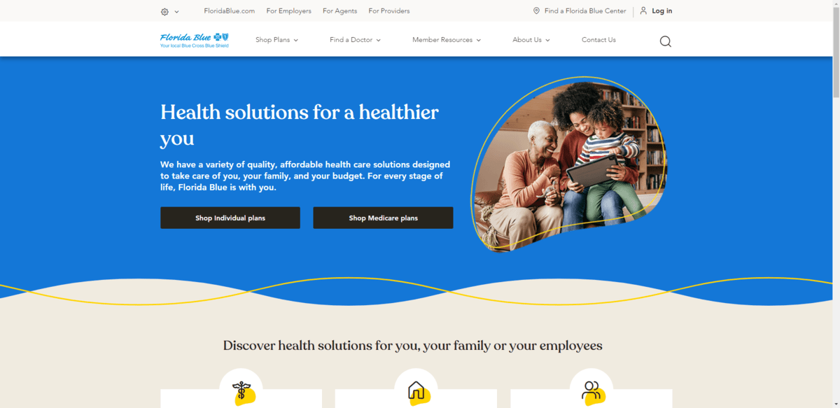
The brand blue is a lighter, calmer shade of blue. However, the website is full of this richer blue color, yellow highlights, as well as beach-inspired background colors. (Being a Florida-based company, that makes sense.)
It appears as though this design were adopted sometime around 2019 or 2020. Before that in 2018, however, the design played it much safer:
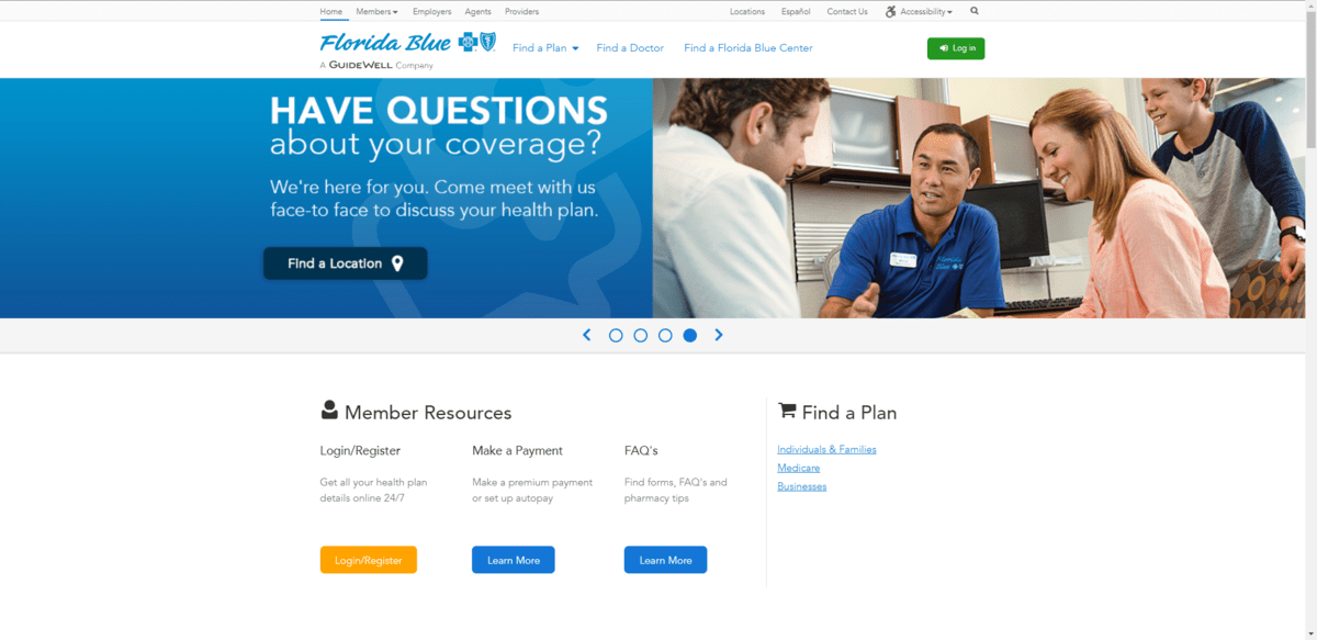
There’s a ton of blue all over this homepage and website. The man in the photo above is even wearing a dark blue shirt. Most of the shades either match the light blue of the brand or are a deeper blue color.
As insurance companies seek to win over younger customers, their products need to be designed to build trust with them. While color theory does have a role to play in design, what matters most these days is having a modern, attractive and usable design. And not being afraid to use color to liven up the experience and help keep them focused is part of that.
Imagery on the web has changed a lot over the last decade. A lot of this has to do with the array of stock photography sources now available.
Where once we relied on the likes of Shutterstock to source imagery when clients didn’t have any, there are so many options now available. Because of this growing field of stock photography—taken by pros and amateurs alike—we’ve seen a more diverse and authentic range of imagery become available.
Take a look at the homepage for United Healthcare in 2023:
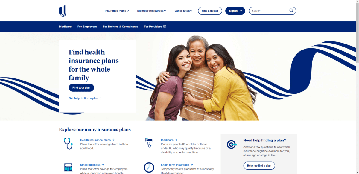
Here we see three women who appear to be related, smiling and hugging one another. It looks realistic, the kind of thing you might see of a family posing on social media.
This was that same website’s homepage in 2018:
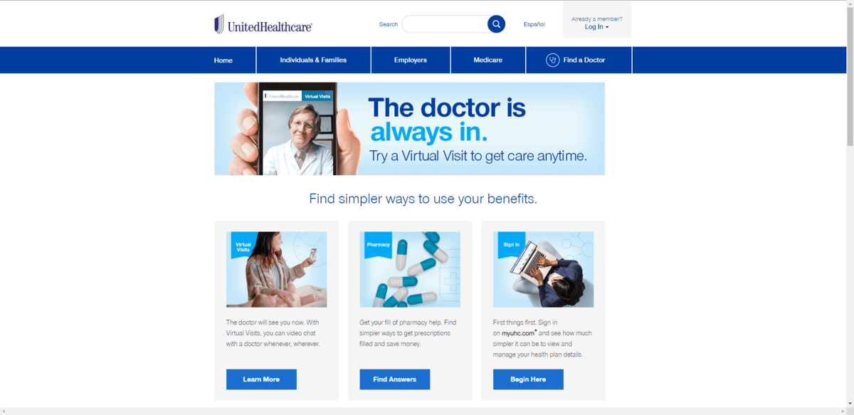
You can see that United Healthcare was making technological strides back then as the focus of this section is around telehealth. Despite that, there’s nothing special about these photos. From the cheesy smiling doctor to the overhead shot of a woman typing on her laptop, this is the typical generic stuff we used to find all over websites when stock photography was limited (or just too expensive to use).
These days, we’re not limited by choice. We’re also much more cognizant of the need for inclusive design. As a result, health insurance companies will start using (if they’re not already) images that reflect the wide range of people who use their products.
In both of the 2023 examples above, you’ll see some examples of the types of geometric shapes that are common. Florida Blue uses yellow curved lines while United has a blue ribbon shape.
They’re not the only ones mixing geometric shapes with photography. Aetna, for instance, has placed its branded heart shape into this hero image:
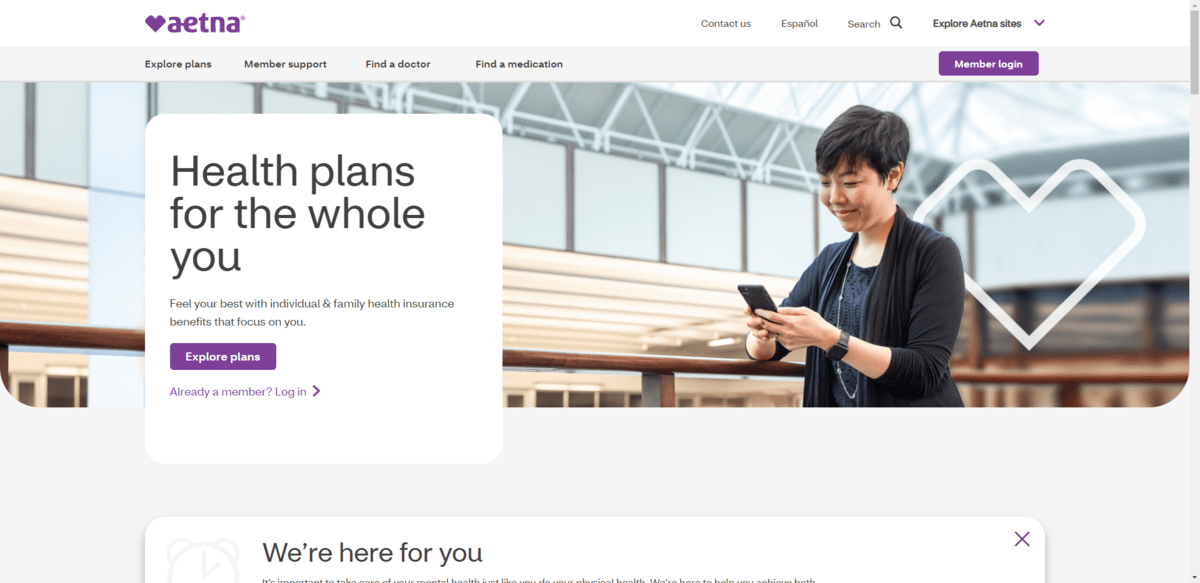
It’s a subtle addition, but still one that is sure to get noticed as people consider the call to action.
You’ll find a bolder, more obvious example of geometric design on the website for Equipsme:
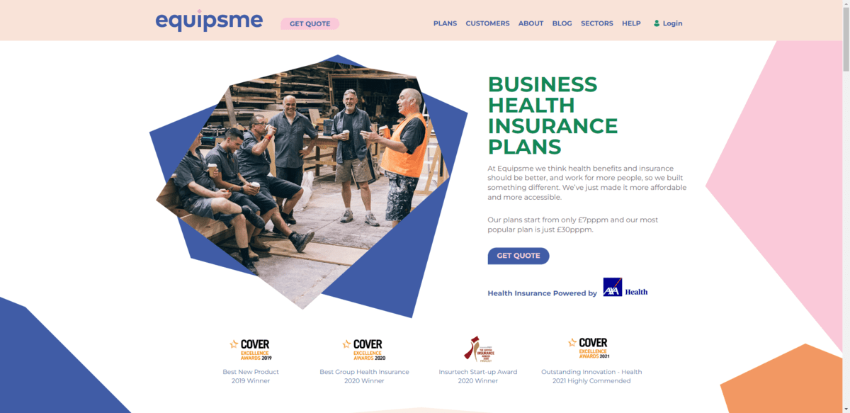
These colorful polygon shapes serve a number of purposes in the grand scheme of the design. For starters, they provide an interesting visual frame for the text in the hero section.
Secondly, the shapes suggest that Equipsme is not like other companies. If it were, the design would probably be made up of ample white space and rectangular content blocks that are equally spaced out. The haphazard scattering of shapes, their bold colors and the unbalanced sides give the site and brand an original feel.
There will always be a huge demand for health insurance. However, the big health insurance companies can no longer take anything for granted. With cheaper, super flexible and more digitally savvy competitors entering the market, they’re going to really need to work for their customers’ business.
One way we’re seeing this happen is through customer-centric content—high-quality content that goes beyond explaining why you should buy insurance from Company A instead of Company B. Andy Schoonover, the CEO and founder of CrowdHealth, explains why this has become a necessity:
High-quality, customer-centric content give health insurance companies and alternative counterparts the ability to:
Humana’s website, for instance, has two top-level menus in its navigation. One with a list of insurance plans and one dedicated to Member Resources:

Shopping for health insurance can be stressful if you feel like you’re not getting all the facts. Many times, you’re redirected to a PDF benefits sheet and all it really does is breakdown what percentage you owe for different services.
This is why more health insurance websites offer up extensive detail like this. It’s not enough to tell customers what their deductible or premium is.
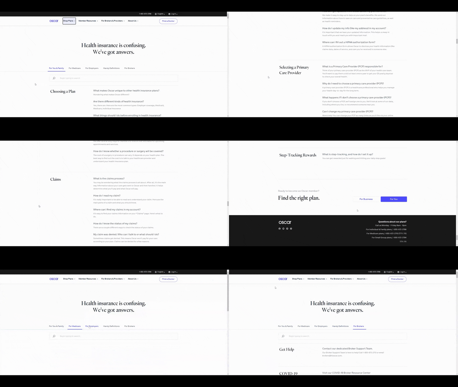
There are other ways to use website content to offer greater transparency for customers (and soon-to-be customers). Oscar, for example, has a huge FAQs page:
Another website that offers up a ton of content to improve customers’ experience is VSP:
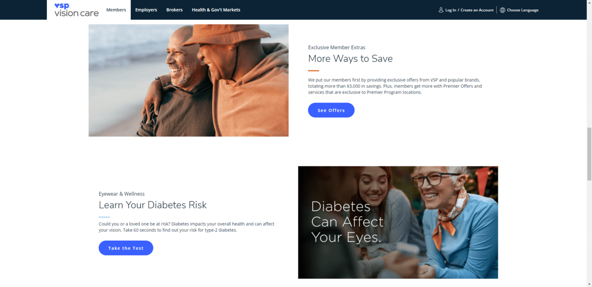
Here you can see that the homepage has an area where customers learn about special member extras. There’s also a section where they can take a test and learn what their diabetes risk is.
The way this homepage and the site as a whole are designed leads one to believe that this company puts people first. Even if someone visits the site and they’re not sure if they want to buy vision insurance from the company, they’ll still find really helpful resources related to their eye health. And that’s the kind of thing that will stick with someone if they ever need to go shopping for a new vision insurance provider again.
Bottom line: The content you put on these websites needs to make insurance companies feel human, honest and supportive.
Now, this is an area where traditional health insurance websites have fallen short. I get why that is.
These companies have had a long time to accumulate customer reviews. As I mentioned before, many insurance companies took for granted the fact that customers needed their health plans and, in many cases, had no choice but to use them (based on where they lived, who they worked for, etc.). So it’s not like customer service was a top priority for them.
These newer companies, however, understand that customer care matters. That’s why many of these health insurance alternatives were started. So these websites spare no expense when it comes to showing off customer reviews.
CrowdHealth, for instance, includes a testimonial slider along with a link to its rating on Trustpilot:
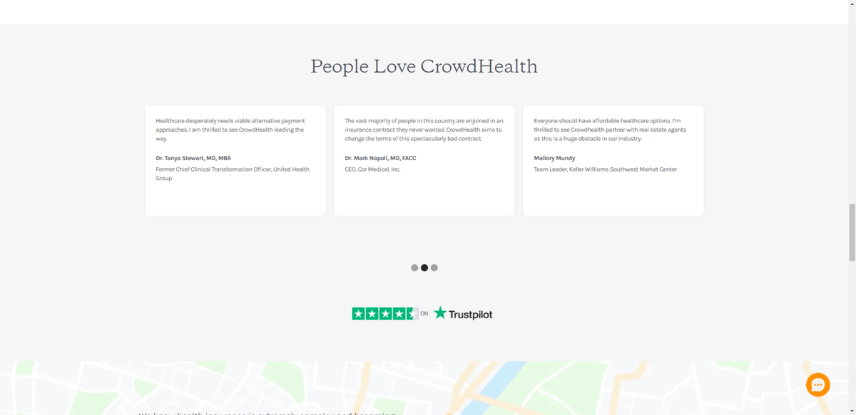
It might not be a perfect 5-star score, but 4.7 is nothing to scoff at. Go ahead and Google the name of an established health insurance company and “customer reviews.” Trust me, it’s not pretty.
Mira is another company that touts its customer testimonials on the homepage:
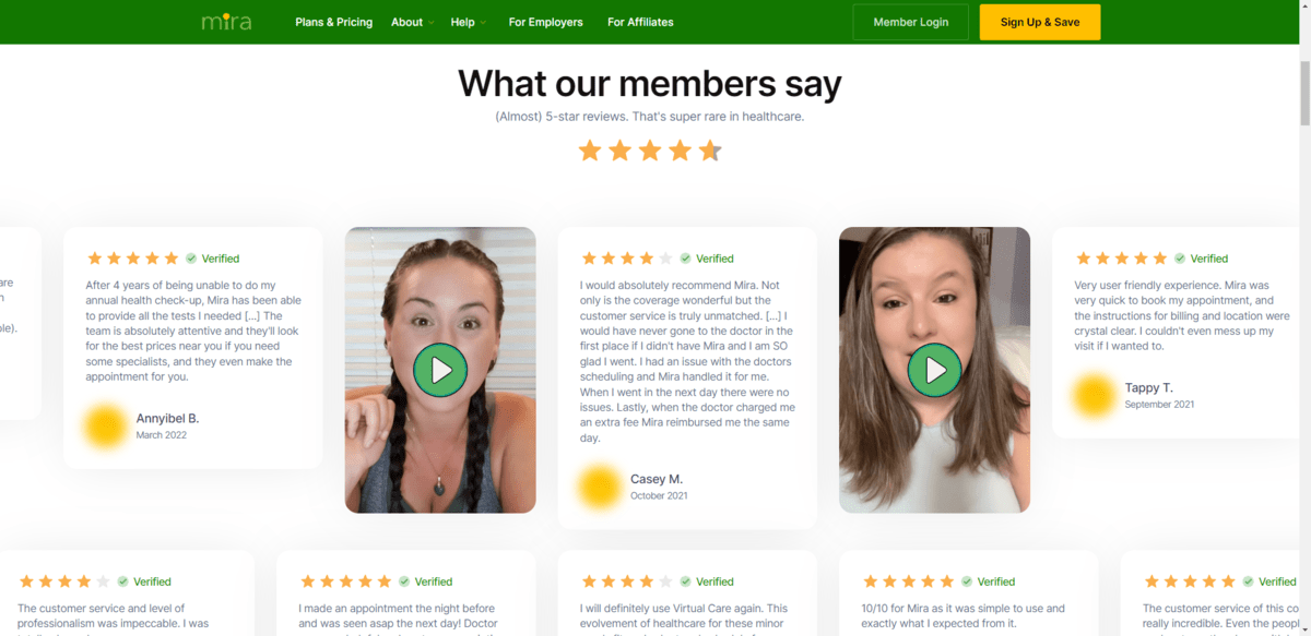
There are two rows of customer testimonials in this section. There are a number of reasons why this design is noteworthy:
While regular insurance companies might not have a history of great customer service or positive reviews, they’re likely to be turning this around now. So while you might not be able to show off a great score on a site like Trustpilot, you can add recent rave reviews from customers on their website.
This is one of the ways in which alternative insurance companies are gaining a competitive edge. So traditional insurers are going to have to do the same if they want to keep up.
While website content and FAQs can shed more light on pricing, you’re still more likely to see buttons on traditional insurers’ sites that invite customers to “Get Quote” than any concrete details regarding prices. This is another way in which newer insurance companies and alternatives are setting themselves apart and building trust with prospective customers.
Sidecar, for example, has a page called Care Calculator:
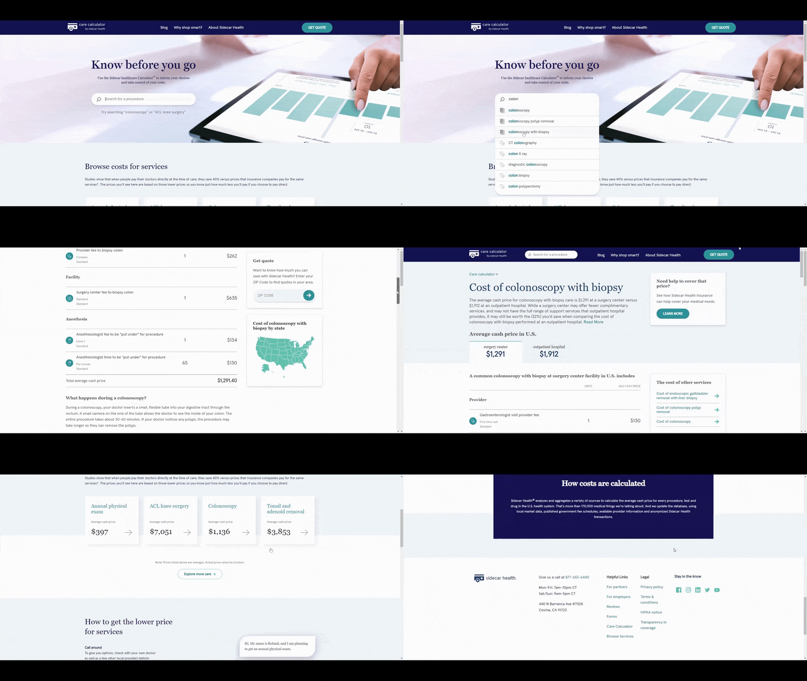
This page has a search bar that enables people to look up common procedures and to see what the average cost of them are. This is something we as patients aren’t usually aware of. We just pay what the health insurance company tells us to pay.
With these alternative insurance models, customers don’t have to settle for that. So as this page goes on to explain, there’s a way to pay less for these procedures. Considering the fact that people might be experiencing sticker shock after seeing how much these things cost out-of-pocket, that’s a smart move.
Another option is to publish the monthly premiums somewhere on the site. While that’s not possible for every insurance company if pricing is variable, some can. That’s what Mira has done here:
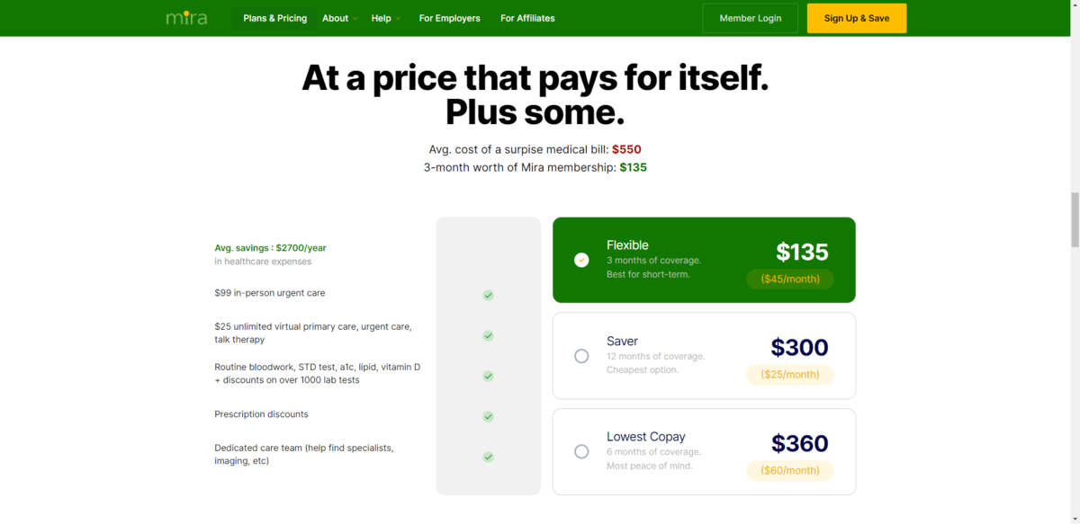
The table breaks down everything that’s included in the coverage. Customers can then choose from three predictable pricing options. Regardless of what they choose, they see that it’ll save them over $2,000 every year.
If one of the company’s main differentiators is the cost of insurance, then make sure the website is as transparent about it as possible. If it’s not, it’s still a good idea to find ways to add information about pricing—average premiums, tips on lowering costs, cost calculators, etc.
While these trends are specific to websites, they’re just as applicable to an insurance company’s mobile app or patient portal. After all, the website is just the first step. To create a seamless transition from the website to the app, everything needs to look and feel the same way.
That said, when it comes to the customer portals, you’re going to need to start thinking about other ways in which they need to evolve.
If you haven’t spent time inside of the customer account area for an alternative insurance provider, find a way to. You’ll likely discover that they’re blazing a trail that’s full of customer-centric technologies that traditional insurance companies haven’t yet thought to use. Like AI chatbots, built-in telehealth interfaces, etc.
This applies to all industries. As disruptive companies and technologies show customers that there are new and better ways of doing things, that’s where you need to focus your attention as a designer. Because that’s where your target users will be looking, too.
Continue reading...
Similar to the disruption we’ve seen going on in the financial services industry because of fintech, something similar seems to be happening with health insurance right now.
Truthfully, it was only a matter of time before the health insurance industry got shaken up. It seems like more and more of our longstanding institutions now face healthy competition from tech-friendly, customer-first alternatives.
It’s not just the companies’ offerings that are evolving in light of the disruption. The designs of their digital products are evolving as well.
I won’t be able to speak to the customer-facing products themselves, since getting access to account portals is difficult unless you’re a customer. (And there’s only so much insurance I can buy myself!) What I can do today, however, is pick apart the designs of leading companies in the field and share the six website design trends I’m seeing.
If you’re currently designing for the health insurance space (or healthcare in general) or want to, this is what you need to know about its changing digital face:
Design Trends for Health Insurance Websites
As the health insurance industry is shaken up by the sharing economy, these companies are being forced to evolve in order to stay in step with the competition. In terms of what that means for insurance websites, here is what we’re seeing:
More Adventurous Colors
Take a look at old school insurance companies that have been around forever and you’ll see lots of blue. Sometimes there’s green. But most of these companies built their visual brand identities around the trust-building blue.
While innovation is necessary, destroying brand recognition is a bad idea. So what some of these companies have been doing is injecting their web designs with bright, adventurous colors to give their digital products more modern appearances.
Take Florida Blue, for instance. This is what the hero section on the homepage looks like in 2023:

The brand blue is a lighter, calmer shade of blue. However, the website is full of this richer blue color, yellow highlights, as well as beach-inspired background colors. (Being a Florida-based company, that makes sense.)
It appears as though this design were adopted sometime around 2019 or 2020. Before that in 2018, however, the design played it much safer:

There’s a ton of blue all over this homepage and website. The man in the photo above is even wearing a dark blue shirt. Most of the shades either match the light blue of the brand or are a deeper blue color.
As insurance companies seek to win over younger customers, their products need to be designed to build trust with them. While color theory does have a role to play in design, what matters most these days is having a modern, attractive and usable design. And not being afraid to use color to liven up the experience and help keep them focused is part of that.
Diverse Imagery
Imagery on the web has changed a lot over the last decade. A lot of this has to do with the array of stock photography sources now available.
Where once we relied on the likes of Shutterstock to source imagery when clients didn’t have any, there are so many options now available. Because of this growing field of stock photography—taken by pros and amateurs alike—we’ve seen a more diverse and authentic range of imagery become available.
Take a look at the homepage for United Healthcare in 2023:

Here we see three women who appear to be related, smiling and hugging one another. It looks realistic, the kind of thing you might see of a family posing on social media.
This was that same website’s homepage in 2018:

You can see that United Healthcare was making technological strides back then as the focus of this section is around telehealth. Despite that, there’s nothing special about these photos. From the cheesy smiling doctor to the overhead shot of a woman typing on her laptop, this is the typical generic stuff we used to find all over websites when stock photography was limited (or just too expensive to use).
These days, we’re not limited by choice. We’re also much more cognizant of the need for inclusive design. As a result, health insurance companies will start using (if they’re not already) images that reflect the wide range of people who use their products.
Geometric Shapes
In both of the 2023 examples above, you’ll see some examples of the types of geometric shapes that are common. Florida Blue uses yellow curved lines while United has a blue ribbon shape.
They’re not the only ones mixing geometric shapes with photography. Aetna, for instance, has placed its branded heart shape into this hero image:

It’s a subtle addition, but still one that is sure to get noticed as people consider the call to action.
You’ll find a bolder, more obvious example of geometric design on the website for Equipsme:

These colorful polygon shapes serve a number of purposes in the grand scheme of the design. For starters, they provide an interesting visual frame for the text in the hero section.
Secondly, the shapes suggest that Equipsme is not like other companies. If it were, the design would probably be made up of ample white space and rectangular content blocks that are equally spaced out. The haphazard scattering of shapes, their bold colors and the unbalanced sides give the site and brand an original feel.
Customer-Centric Content
There will always be a huge demand for health insurance. However, the big health insurance companies can no longer take anything for granted. With cheaper, super flexible and more digitally savvy competitors entering the market, they’re going to really need to work for their customers’ business.
One way we’re seeing this happen is through customer-centric content—high-quality content that goes beyond explaining why you should buy insurance from Company A instead of Company B. Andy Schoonover, the CEO and founder of CrowdHealth, explains why this has become a necessity:
“Health insurance is cold, oftentimes unreliable, and perversely incentivized. We’re changing the game at CrowdHealth. Treating people like real people, like extensions to our family, supporting them in their health journey, and helping get their bills paid at a low cost.”
High-quality, customer-centric content give health insurance companies and alternative counterparts the ability to:
- Help customers get started.
- Answer the most common questions and concerns that customers have.
- Offer more transparency around what their plans entail.
- Explain rewards and other special features that come with insurance plans.
- Provide health-related tips.
Humana’s website, for instance, has two top-level menus in its navigation. One with a list of insurance plans and one dedicated to Member Resources:

Shopping for health insurance can be stressful if you feel like you’re not getting all the facts. Many times, you’re redirected to a PDF benefits sheet and all it really does is breakdown what percentage you owe for different services.
This is why more health insurance websites offer up extensive detail like this. It’s not enough to tell customers what their deductible or premium is.
There are other ways to use website content to offer greater transparency for customers (and soon-to-be customers). Oscar, for example, has a huge FAQs page:

Another website that offers up a ton of content to improve customers’ experience is VSP:

Here you can see that the homepage has an area where customers learn about special member extras. There’s also a section where they can take a test and learn what their diabetes risk is.
The way this homepage and the site as a whole are designed leads one to believe that this company puts people first. Even if someone visits the site and they’re not sure if they want to buy vision insurance from the company, they’ll still find really helpful resources related to their eye health. And that’s the kind of thing that will stick with someone if they ever need to go shopping for a new vision insurance provider again.
Bottom line: The content you put on these websites needs to make insurance companies feel human, honest and supportive.
Customer Reviews
Now, this is an area where traditional health insurance websites have fallen short. I get why that is.
These companies have had a long time to accumulate customer reviews. As I mentioned before, many insurance companies took for granted the fact that customers needed their health plans and, in many cases, had no choice but to use them (based on where they lived, who they worked for, etc.). So it’s not like customer service was a top priority for them.
These newer companies, however, understand that customer care matters. That’s why many of these health insurance alternatives were started. So these websites spare no expense when it comes to showing off customer reviews.
CrowdHealth, for instance, includes a testimonial slider along with a link to its rating on Trustpilot:

It might not be a perfect 5-star score, but 4.7 is nothing to scoff at. Go ahead and Google the name of an established health insurance company and “customer reviews.” Trust me, it’s not pretty.
Mira is another company that touts its customer testimonials on the homepage:

There are two rows of customer testimonials in this section. There are a number of reasons why this design is noteworthy:
- It’s colorful and impossible to miss as you scroll through the page.
- There’s a “Verified” mark to confirm that the reviews were left by real customers.
- There are embedded YouTube testimonials from real customers, so it’s not just a wall of text.
- There are review dates so that people can see they’re timely and relevant.
- Not all of them are perfect 5-star reviews.
While regular insurance companies might not have a history of great customer service or positive reviews, they’re likely to be turning this around now. So while you might not be able to show off a great score on a site like Trustpilot, you can add recent rave reviews from customers on their website.
This is one of the ways in which alternative insurance companies are gaining a competitive edge. So traditional insurers are going to have to do the same if they want to keep up.
Price Transparency
While website content and FAQs can shed more light on pricing, you’re still more likely to see buttons on traditional insurers’ sites that invite customers to “Get Quote” than any concrete details regarding prices. This is another way in which newer insurance companies and alternatives are setting themselves apart and building trust with prospective customers.
Sidecar, for example, has a page called Care Calculator:

This page has a search bar that enables people to look up common procedures and to see what the average cost of them are. This is something we as patients aren’t usually aware of. We just pay what the health insurance company tells us to pay.
With these alternative insurance models, customers don’t have to settle for that. So as this page goes on to explain, there’s a way to pay less for these procedures. Considering the fact that people might be experiencing sticker shock after seeing how much these things cost out-of-pocket, that’s a smart move.
Another option is to publish the monthly premiums somewhere on the site. While that’s not possible for every insurance company if pricing is variable, some can. That’s what Mira has done here:

The table breaks down everything that’s included in the coverage. Customers can then choose from three predictable pricing options. Regardless of what they choose, they see that it’ll save them over $2,000 every year.
If one of the company’s main differentiators is the cost of insurance, then make sure the website is as transparent about it as possible. If it’s not, it’s still a good idea to find ways to add information about pricing—average premiums, tips on lowering costs, cost calculators, etc.
Wrapping up
While these trends are specific to websites, they’re just as applicable to an insurance company’s mobile app or patient portal. After all, the website is just the first step. To create a seamless transition from the website to the app, everything needs to look and feel the same way.
That said, when it comes to the customer portals, you’re going to need to start thinking about other ways in which they need to evolve.
If you haven’t spent time inside of the customer account area for an alternative insurance provider, find a way to. You’ll likely discover that they’re blazing a trail that’s full of customer-centric technologies that traditional insurance companies haven’t yet thought to use. Like AI chatbots, built-in telehealth interfaces, etc.
This applies to all industries. As disruptive companies and technologies show customers that there are new and better ways of doing things, that’s where you need to focus your attention as a designer. Because that’s where your target users will be looking, too.
Continue reading...
