
T
Thierry Ciot
Guest
Business applications today need to be responsive to be ready for both mobile and desktop. Build responsive apps easily with no coding with Rollbase.
Creating a responsive web application is a smart strategy—it can get you to market on multiple devices very quickly as well as reduce cost and maintenance. This is particularly true for ephemeral applications (apps built for a short period of intended use). However, building a responsive application is hard and requires specialized knowledge and expertise. This is a problem that Rollbase is designed to solve.
In this blog post, we will see how Rollbase, as a low-code/no-code platform, provides an automatic, built-in responsiveness system to make it a breeze to create responsive applications. In a second installment, we will also cover the extension mechanisms at your disposal to tailor things to specific application needs.
Note that Rollbase also provides adaptive features, but these are beyond the scope of this post. They will be covered in another blog.
Responsive Apps: A UI for Every Device
Responsive web applications were invented because it quickly became very difficult and too costly to maintain separate websites for the multitude of devices out there.
Rollbase provides responsiveness out of the box. To build applications that span smartphones to desktop devices to big TVs, you don’t need to hire specialists or even learn the intricacy of the Bootstrap grid system. You design your pages in sections as you would with many systems and just decide how many columns you want per sections for the largest devices; then you simply drag widgets to section columns. Rollbase will take care of the rest and make your app work well across devices.
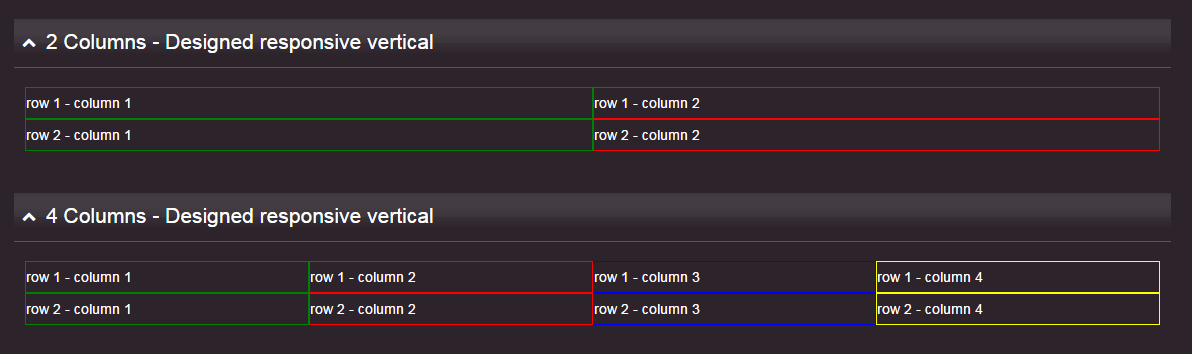
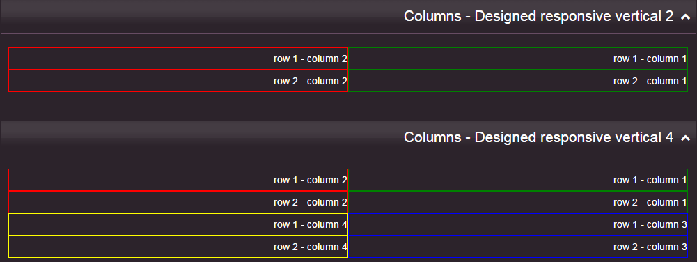
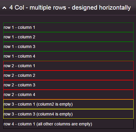
Let’s look at a simple example. In this first example, we have two sections, one with two columns and one with four columns on the widest screen. To make things more comprehensible, we use simple HTML fragments with a colored border to illustrate where the columns are on specific screen size and where they move to on a different screen size.
Since the behavior of the responsive system is independent of the column content, this serves well for our demonstration purpose. This also applies to any items you can drag to section columns in the page designer.
On the widest screen, you can see that all four columns are displayed horizontally:
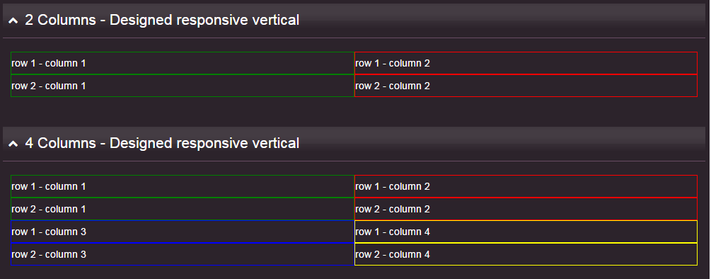
And here is how the same page will render on a medium sized screen:
A couple of things happened:
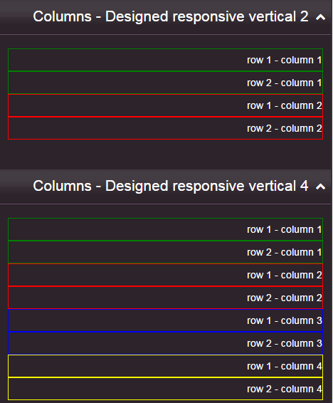
Now let’s look at what happens when we go to mobile device size:
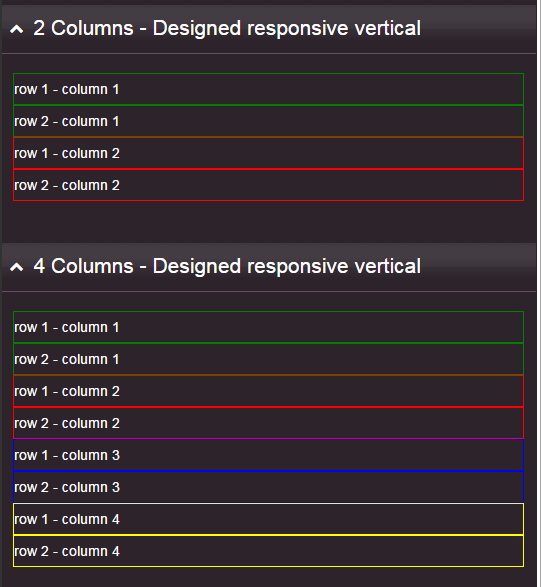
Both sections have now automatically changed to fit nicely into a single column.
The last column to the right (yellow) on a large screen ends up as the last row on a small screen. Another way to explain it, is what you read left to right on a wider screen reads top to bottom on the narrower screen (for left to right languages") ).
).
Right to Left Language Support
We have also worked hard to make responsiveness, along with other Rollbase features, work just as seamlessly when using right to left languages like Arabic, Farsi or Hebrew. This is important as Bootstrap does not support RTL out of the box.
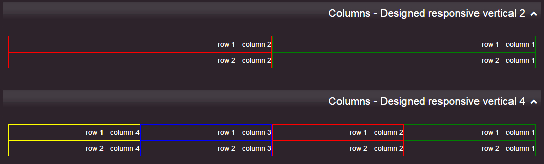
Here is the same application when using an RTL language:
A wide screen, which again displays all four columns horizontally (now from right to left):
When rendered on a medium size screen:
And on a smaller or mobile sized screen:
Responsive Design for Any Grid Layout
To give you even more design choices we let you decide how you'd like to group columns—horizontally or vertically. As a no-code responsive system, this of course requires no coding.
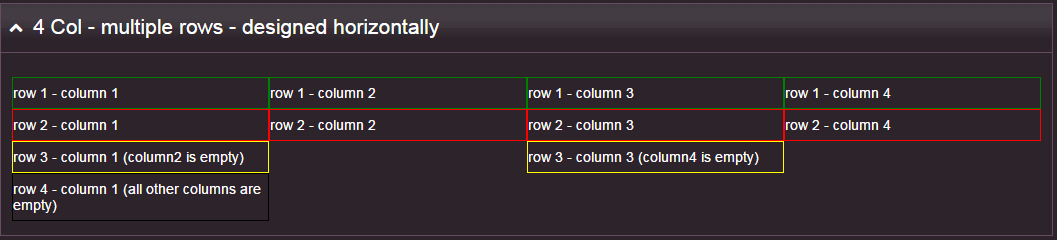
The previous examples showed section columns grouped vertically, but you can design your sections with a horizontal grouping instead. Rather than describe this in text, let's use a visual example that will be clearer. Here, we want all cells in the same row to remain grouped together on smaller screen size.
As an aside, the example also shows that you can have empty columns (on both vertical and horizontal design modes) and they will render appropriately.
When viewed on a wide screen:
When viewed on a medium size screen:
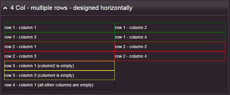
And finally when viewed on the smallest screen:
Deploy Faster with No-code Responsiveness
With Rollbase you can code web applications that work well across devices in hours or days as opposed to weeks and months. The no-code responsiveness in the platform is the key for this level of performance. By using sections and simply specifying the number of columns per section, you can very easily design pages that fit all device sizes.
We also strive to make Rollbase the most flexible platform on the market. Stay tuned for a future post, where we'll explore the extension mechanisms at your disposal to tailor things for specific application needs.
Continue reading...
Creating a responsive web application is a smart strategy—it can get you to market on multiple devices very quickly as well as reduce cost and maintenance. This is particularly true for ephemeral applications (apps built for a short period of intended use). However, building a responsive application is hard and requires specialized knowledge and expertise. This is a problem that Rollbase is designed to solve.
In this blog post, we will see how Rollbase, as a low-code/no-code platform, provides an automatic, built-in responsiveness system to make it a breeze to create responsive applications. In a second installment, we will also cover the extension mechanisms at your disposal to tailor things to specific application needs.
Note that Rollbase also provides adaptive features, but these are beyond the scope of this post. They will be covered in another blog.
Responsive Apps: A UI for Every Device
Responsive web applications were invented because it quickly became very difficult and too costly to maintain separate websites for the multitude of devices out there.
Rollbase provides responsiveness out of the box. To build applications that span smartphones to desktop devices to big TVs, you don’t need to hire specialists or even learn the intricacy of the Bootstrap grid system. You design your pages in sections as you would with many systems and just decide how many columns you want per sections for the largest devices; then you simply drag widgets to section columns. Rollbase will take care of the rest and make your app work well across devices.
Let’s look at a simple example. In this first example, we have two sections, one with two columns and one with four columns on the widest screen. To make things more comprehensible, we use simple HTML fragments with a colored border to illustrate where the columns are on specific screen size and where they move to on a different screen size.
Since the behavior of the responsive system is independent of the column content, this serves well for our demonstration purpose. This also applies to any items you can drag to section columns in the page designer.
On the widest screen, you can see that all four columns are displayed horizontally:
And here is how the same page will render on a medium sized screen:
A couple of things happened:
The second section is now too wide to render as four columns, so it automatically renders as two columns. The blue and yellow columns are now nicely fitted below green and red respectively.
Columns that were grouped vertically remain together (as illustrated with the colored border and the column and row numbers).
There is no change to the first section, which still has enough space to render as two columns.
Now let’s look at what happens when we go to mobile device size:
Both sections have now automatically changed to fit nicely into a single column.
The last column to the right (yellow) on a large screen ends up as the last row on a small screen. Another way to explain it, is what you read left to right on a wider screen reads top to bottom on the narrower screen (for left to right languages
).Right to Left Language Support
We have also worked hard to make responsiveness, along with other Rollbase features, work just as seamlessly when using right to left languages like Arabic, Farsi or Hebrew. This is important as Bootstrap does not support RTL out of the box.
Here is the same application when using an RTL language:
A wide screen, which again displays all four columns horizontally (now from right to left):
When rendered on a medium size screen:
And on a smaller or mobile sized screen:
Responsive Design for Any Grid Layout
To give you even more design choices we let you decide how you'd like to group columns—horizontally or vertically. As a no-code responsive system, this of course requires no coding.
The previous examples showed section columns grouped vertically, but you can design your sections with a horizontal grouping instead. Rather than describe this in text, let's use a visual example that will be clearer. Here, we want all cells in the same row to remain grouped together on smaller screen size.
As an aside, the example also shows that you can have empty columns (on both vertical and horizontal design modes) and they will render appropriately.
When viewed on a wide screen:
When viewed on a medium size screen:
And finally when viewed on the smallest screen:
Deploy Faster with No-code Responsiveness
With Rollbase you can code web applications that work well across devices in hours or days as opposed to weeks and months. The no-code responsiveness in the platform is the key for this level of performance. By using sections and simply specifying the number of columns per section, you can very easily design pages that fit all device sizes.
We also strive to make Rollbase the most flexible platform on the market. Stay tuned for a future post, where we'll explore the extension mechanisms at your disposal to tailor things for specific application needs.
Continue reading...