S
Suzanne Scacca
Guest
Did you know that the average time it takes a new health app user to convert—either into a paying subscriber or engaged user—is about 5 days? Here are three tips to help you design a health and wellness app that converts well and retains users more effectively.
I recently attended a webinar about subscription apps. Specifically, it focused on how to increase user subscriptions and retention rates for health and fitness apps through personalization.
The whole thing got me thinking about the growing popularity of health and wellness apps in the last few years. These can be tricky products to build, what with all the concerns related to privacy and security, not to mention the high profile names already dominating the market.
Let’s assume you’ve got that handled. And that you’re developing an app that meets current consumer demand, fills a gap in the market, and has addressed privacy and security. Oh, and let’s not forget about the regulatory compliance aspect of it.
With all that out of the way, how do you get new users to become engaged users and paying subscribers? While you might have an app that provides a much-needed solution, users need to actually use the app to see that for themselves.
In this post, we’ll look at various ways to increase user engagement, subscriptions and retention for your health-related apps.
Physical and mental health and wellness apps are flourishing. How do you ensure that yours carves out a piece of the booming market?
Here are some tips to help you out.
Health and wellness apps are often built as a substitute for or supplement to real world health providers (like someone getting a workout app instead of hiring a personal trainer). As such, you need to drill down and figure out what sort of features will convince users to “hire” your app over the alternative.
Let’s use a real-world example to demonstrate why this is so important.
Let’s say you’re looking for a new dentist. One office has basic services like oral exams and cleanings, wisdom tooth extractions and fillings. Another office has oral exams and cleanings, but none of the other procedures. Instead, they sell products like electric toothbrushes, whitening kits and Invisalign.
Which one are you likely to choose? Probably the one that provides services that will help you today (i.e., the cleaning) and will help you in the future if you run into issues with your teeth.
Wasting time on app features that users consider nice-to-have or inessential is a bad move. And it’s not just wasting time on building them. You also don’t want those features to be front and center when promoting the app online, in the app store or even in the onboarding process.
But in order to know what matters most and will be indispensable to your target users, you have to do your research. Get to know them within the context of what you’re building.
Zocdoc, for instance, has built an app to address the problem of finding healthcare providers and booking appointments. Not only that, the app serves as a centralized platform to manage all of one’s provider relationships and scheduling.
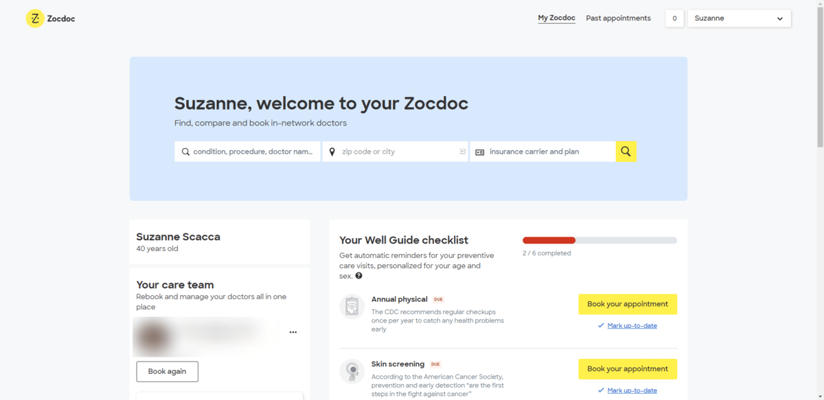
Although there’s no converting to a paid user in this app, it’s clear that the app was carefully designed to retain users.
For starters, the navigation is greatly simplified. The home screen personalization is also perfectly done. I’m greeted by name, which forces me to take notice of the convenient provider search function. The remainder of the content on the page is personalized as well. The sidebar contains information about my providers and the checklist is even tailored to my needs as a woman (at the bottom is an item for a “well-woman exam”).
Bottom line: When you’re studying your users, examine their needs from as many angles as you can. The more you can personalize the app and tailor it to their needs, the more well-received it will be.
There was an interesting story I heard during the subscription app webinar I mentioned. It had to do with the relationship between the trial length and the app’s conversion rate.
The product being discussed was a mindfulness app targeting new moms. What they found was that longer trial periods were more effective at converting users. It made a lot of sense to the marketing team when they got to know their users more. New moms wanted the help offered by the app, but they needed the freedom to try out the app on more relaxed and lengthy trial terms.
Research done by CleverTap backs this up.
On average, it takes a new user less than 30 minutes to engage with a health and fitness app after installing it. Compared to apps in the education, media and entertainment sectors, this is the fastest install-to-engagement rate.
However, health and fitness app users take the longest to commit to a paid subscription. In general, it takes more than five days for a user to subscribe. For other apps, it’s only about a day.
So what can you do with this information as a web designer?
The biggest thing is to ensure that you nail the onboarding process. This includes:
The beginning of the Calm mobile app onboarding process is a good example to check out.
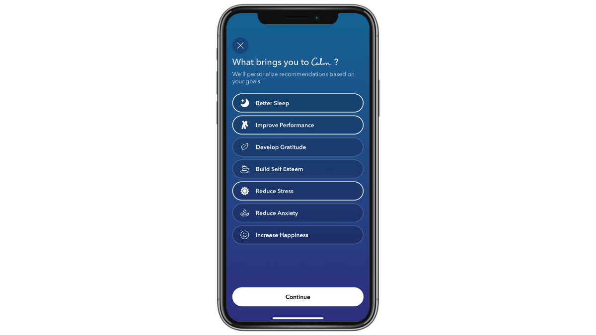
The onboarding screens are engaging right from the get go. It starts by reminding users to take a breath. Then it asks them what their mindfulness goals are. The pre-written answers make it feel as though the app understands their needs.
Building the structure of your app so that your users’ main goals are prioritized within the app’s architecture will also be helpful. If they step inside the app and can’t figure out where to do the most basic things they came there for, they’re not going to stick around to try and figure it out.
This is where getting to know your users will be helpful. Even if you’re not responsible for planning out the sales funnel that gets new users into the app and turns them into subscribers, you have a vital role to play in designing the app they interact with as well as the marketing emails they receive while they’re being courted by your marketing and sales teams.
When it comes to health and wellness, a sales-driven approach just doesn’t make sense. Even during the onboarding and trial phase.
Typically, a health and wellness app requires a serious commitment on the part of the user. That’s why it can take so long for them to convert. So you’re not going to convert trial users into subscribers by constantly placing “Upgrade Now” or “Become Subscriber” buttons in front of them.
The same can also be said for health apps that gate off so much content or so many features that it is unusable. If your users can’t experience the value of the app, what is going to convince them to pay for it?
The Crunch Fitness mobile app is a good example of this.
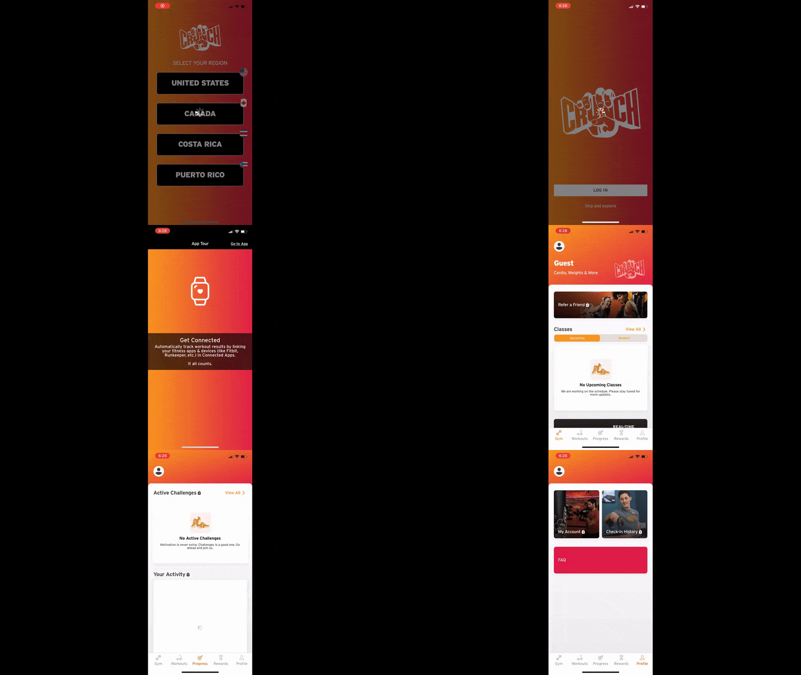
Users are free to access the app even without a subscription to the gym. Not only will unfettered access give them a better sense for the value of the mobile app, but of the gym membership itself.
One of the first things they see is a note about how their gym app connects to their fitness trackers, which may be one of the first things they’re wondering when choosing between gyms or fitness programs. Then they are able to step inside the app to explore the features without issue.
So as you build out your app, focus on what is needed during onboarding to demonstrate the real value of the app. Also, ask yourself if the live subscription features will be enough to convince users to log in every day (or somewhat regularly) so they continue to reap the benefits of it.
Regular, meaningful engagement with the app can help lower user attrition rates. That’s because they’re getting to take advantage of all that the app has to offer, even if they’re on the free trial. Especially if they’re on the free trial.
Honestly? I would suggest that you minimize the conversion elements within health and fitness apps.
When someone signs up for a free trial, they’re well aware of it. What’s more, if your marketing team does their job right, they’ll be reengaging with those users throughout the course of the trial—via email, with blog posts, on social media, etc. So they’ll have regular reminders to log back in and get a feel for the app, all while there’s a ticking clock in the background.
Your job is to build an app that they want to turn into a habit. If you can get them into that routine of logging in and using it every day, they’ll subscribe without any prompting and remain subscribed for a long time to come.
The trick to increasing health app subscriptions and user retention isn’t to funnel as many new users into the app as possible. You need to make your app stick. It has to become part of their regular healthcare routine.
When it comes to health and fitness, a more delicate and measured approach is required. First, you need to truly understand who your users are. Then, figure out what specifically they need from your app. Finally, serve up personalized content and messaging in order to help them meet those needs within the amazing health app you built.
Continue reading...
I recently attended a webinar about subscription apps. Specifically, it focused on how to increase user subscriptions and retention rates for health and fitness apps through personalization.
The whole thing got me thinking about the growing popularity of health and wellness apps in the last few years. These can be tricky products to build, what with all the concerns related to privacy and security, not to mention the high profile names already dominating the market.
Let’s assume you’ve got that handled. And that you’re developing an app that meets current consumer demand, fills a gap in the market, and has addressed privacy and security. Oh, and let’s not forget about the regulatory compliance aspect of it.
With all that out of the way, how do you get new users to become engaged users and paying subscribers? While you might have an app that provides a much-needed solution, users need to actually use the app to see that for themselves.
In this post, we’ll look at various ways to increase user engagement, subscriptions and retention for your health-related apps.
3 Things You Can Do to Increase Health App Subscriptions and Engagement
Physical and mental health and wellness apps are flourishing. How do you ensure that yours carves out a piece of the booming market?
Here are some tips to help you out.
1. Identify Your Users’ True Needs
Health and wellness apps are often built as a substitute for or supplement to real world health providers (like someone getting a workout app instead of hiring a personal trainer). As such, you need to drill down and figure out what sort of features will convince users to “hire” your app over the alternative.
Let’s use a real-world example to demonstrate why this is so important.
Let’s say you’re looking for a new dentist. One office has basic services like oral exams and cleanings, wisdom tooth extractions and fillings. Another office has oral exams and cleanings, but none of the other procedures. Instead, they sell products like electric toothbrushes, whitening kits and Invisalign.
Which one are you likely to choose? Probably the one that provides services that will help you today (i.e., the cleaning) and will help you in the future if you run into issues with your teeth.
Wasting time on app features that users consider nice-to-have or inessential is a bad move. And it’s not just wasting time on building them. You also don’t want those features to be front and center when promoting the app online, in the app store or even in the onboarding process.
But in order to know what matters most and will be indispensable to your target users, you have to do your research. Get to know them within the context of what you’re building.
- What are the current problems they’re dealing with?
- What problems will your app aim to solve?
- What sorts of solutions are out there now?
- Which companies are getting it right? Which are falling short?
Zocdoc, for instance, has built an app to address the problem of finding healthcare providers and booking appointments. Not only that, the app serves as a centralized platform to manage all of one’s provider relationships and scheduling.

Although there’s no converting to a paid user in this app, it’s clear that the app was carefully designed to retain users.
For starters, the navigation is greatly simplified. The home screen personalization is also perfectly done. I’m greeted by name, which forces me to take notice of the convenient provider search function. The remainder of the content on the page is personalized as well. The sidebar contains information about my providers and the checklist is even tailored to my needs as a woman (at the bottom is an item for a “well-woman exam”).
Bottom line: When you’re studying your users, examine their needs from as many angles as you can. The more you can personalize the app and tailor it to their needs, the more well-received it will be.
2. Give Your Users the Time They Need
There was an interesting story I heard during the subscription app webinar I mentioned. It had to do with the relationship between the trial length and the app’s conversion rate.
The product being discussed was a mindfulness app targeting new moms. What they found was that longer trial periods were more effective at converting users. It made a lot of sense to the marketing team when they got to know their users more. New moms wanted the help offered by the app, but they needed the freedom to try out the app on more relaxed and lengthy trial terms.
Research done by CleverTap backs this up.
On average, it takes a new user less than 30 minutes to engage with a health and fitness app after installing it. Compared to apps in the education, media and entertainment sectors, this is the fastest install-to-engagement rate.
However, health and fitness app users take the longest to commit to a paid subscription. In general, it takes more than five days for a user to subscribe. For other apps, it’s only about a day.
So what can you do with this information as a web designer?
The biggest thing is to ensure that you nail the onboarding process. This includes:
- The onboarding screens shown after they start the trial and install the app.
- The in-app tour (if you think it would be beneficial to have one).
- The setup wizard (again, if you think it’s useful to include).
- The follow-up email sequence sent throughout their trial.
The beginning of the Calm mobile app onboarding process is a good example to check out.

The onboarding screens are engaging right from the get go. It starts by reminding users to take a breath. Then it asks them what their mindfulness goals are. The pre-written answers make it feel as though the app understands their needs.
Building the structure of your app so that your users’ main goals are prioritized within the app’s architecture will also be helpful. If they step inside the app and can’t figure out where to do the most basic things they came there for, they’re not going to stick around to try and figure it out.
This is where getting to know your users will be helpful. Even if you’re not responsible for planning out the sales funnel that gets new users into the app and turns them into subscribers, you have a vital role to play in designing the app they interact with as well as the marketing emails they receive while they’re being courted by your marketing and sales teams.
3. Focus on Engagement, Not Sales
When it comes to health and wellness, a sales-driven approach just doesn’t make sense. Even during the onboarding and trial phase.
Typically, a health and wellness app requires a serious commitment on the part of the user. That’s why it can take so long for them to convert. So you’re not going to convert trial users into subscribers by constantly placing “Upgrade Now” or “Become Subscriber” buttons in front of them.
The same can also be said for health apps that gate off so much content or so many features that it is unusable. If your users can’t experience the value of the app, what is going to convince them to pay for it?
The Crunch Fitness mobile app is a good example of this.

Users are free to access the app even without a subscription to the gym. Not only will unfettered access give them a better sense for the value of the mobile app, but of the gym membership itself.
One of the first things they see is a note about how their gym app connects to their fitness trackers, which may be one of the first things they’re wondering when choosing between gyms or fitness programs. Then they are able to step inside the app to explore the features without issue.
So as you build out your app, focus on what is needed during onboarding to demonstrate the real value of the app. Also, ask yourself if the live subscription features will be enough to convince users to log in every day (or somewhat regularly) so they continue to reap the benefits of it.
Regular, meaningful engagement with the app can help lower user attrition rates. That’s because they’re getting to take advantage of all that the app has to offer, even if they’re on the free trial. Especially if they’re on the free trial.
Honestly? I would suggest that you minimize the conversion elements within health and fitness apps.
When someone signs up for a free trial, they’re well aware of it. What’s more, if your marketing team does their job right, they’ll be reengaging with those users throughout the course of the trial—via email, with blog posts, on social media, etc. So they’ll have regular reminders to log back in and get a feel for the app, all while there’s a ticking clock in the background.
Your job is to build an app that they want to turn into a habit. If you can get them into that routine of logging in and using it every day, they’ll subscribe without any prompting and remain subscribed for a long time to come.
Wrap-up
The trick to increasing health app subscriptions and user retention isn’t to funnel as many new users into the app as possible. You need to make your app stick. It has to become part of their regular healthcare routine.
When it comes to health and fitness, a more delicate and measured approach is required. First, you need to truly understand who your users are. Then, figure out what specifically they need from your app. Finally, serve up personalized content and messaging in order to help them meet those needs within the amazing health app you built.
Continue reading...
