S
Suzanne Scacca
Guest
The fintech industry has never really been afraid to break the mold or to shake things up. But does the same thing go for using colors in their digital product designs? Or is that a level of disruption that will be too much for their users? In this post, we’ll explore.
Whether you’re creating a logo and design system for a fintech company or you’re building their digital product, color is an important consideration. Do you go the way of traditional financial services companies and stick with safe and trustworthy blues? Or do you break free of that mold and experiment with bolder color choices?
In this post, we’ll look into the psychology of color. In particular, how it impacts fintech customers and then we’ll discuss ways to use it when designing fintech websites and apps.
Color doesn’t just make a UI look nice. It can be a powerful tool that enables a brand to invoke a certain emotion or response from those who encounter it. Here’s why the psychology of color is especially important to think about when choosing color for fintech brands:
Color psychology is the study of how color influences human behavior as well as mood. When certain colors and color combinations are used in design, for instance, you can affect user satisfaction, engagement rates and even conversions.
In order to do this, you have to start with an understanding of what individual colors mean. For instance, here are some concepts and symbols that these colors are commonly associated with:
Blue:
Green:
Purple:
Black:
White:
Red:
Orange:
Yellow:
As you can see, there’s a pretty broad range of interpretations and symbols associated with any one color.
The context in which the color is used, the hue, as well as the amount used can all impact how it’s interpreted. Color combinations can also alter how individual colors are perceived consciously (as visually pleasing) or subconsciously (as symbolic).
You also have to consider your target audience. How a color is interpreted in one culture may be completely different in another.
Not only that, you should take demographics into consideration when figuring out the psychological meaning and symbolism of the colors you’ve used. For example, color consultant Amy Wax suggests that there are generational colors.
Boomers, for instance, tend to prefer mature, practical and calming color palettes. Gen Xers “like exotic greens and reds, midwestern browns, and violets.” And Millennials have their own color named for them: Millennial Pink.
Another thing to consider is usability and accessibility. While colors can certainly be used to make your users feel a certain way, you don’t want them to get in the way of the basic usability of your product.
Differentiation is crucial in the financial services space. With more fintech companies disrupting the space every year, your website and/or app needs to clearly distinguish itself from the rest.
Color is one of the first things that users notice, so that’s a great place to start. To give you an idea of what you’re up against when it comes to traditional financial services, here’s what some of the leading finserv company websites look like:
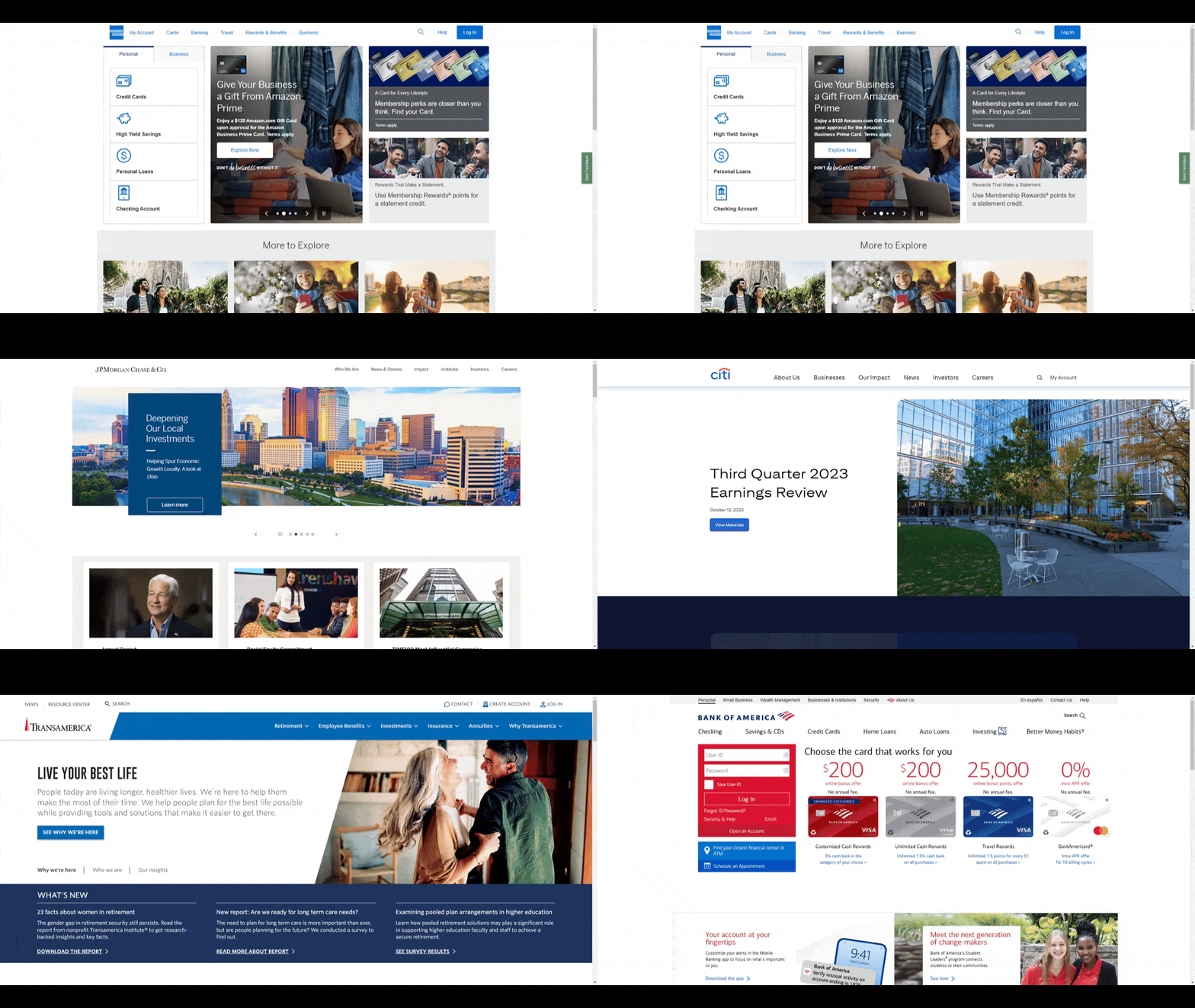
Here you see the homepages for:
They all look eerily similar. Solid white backgrounds. Blue accent colors. And the occasional hint of red. That said, you can see how these colors were consciously chosen to create a sense of safety and stability.
Thanks to the conservative color palettes used by traditional finserv companies, this gives you a lot of room to explore with fintech. But just because you can push the boundaries of color, that doesn’t mean that the usual rules of good design and UX don’t apply.
The colors you choose need to align with your brand identity and values. They should also instill trust. They should be memorable. Last but not least, they should be aesthetically pleasing.
With that out of the way, let’s talk about what kinds of colors and palettes work for fintech. Here are the most common trends I’m seeing:
Purple is a really common color used in fintech design. All different shades are used too, which is probably because the brands want to send different signals to their users.
Here’s a look at how the following fintech brands use purple:
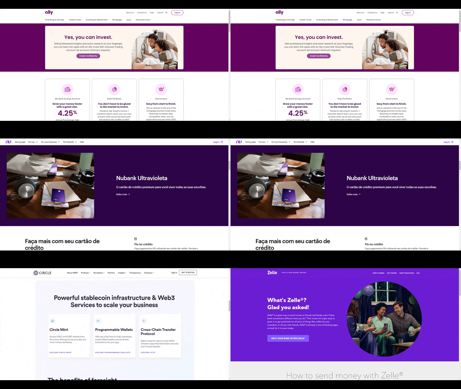
If we look back at the significance of purple, there would be numerous ways to interpret these colors. I definitely think in each case, purple is supposed to suggest that these are forward-thinking brands that will carry their users into the future.
The color also might be used to convey a sense of luxury or ingenuity in certain cases.
There are numerous brands that are throwing caution to the wind and going big and bold with color, like:
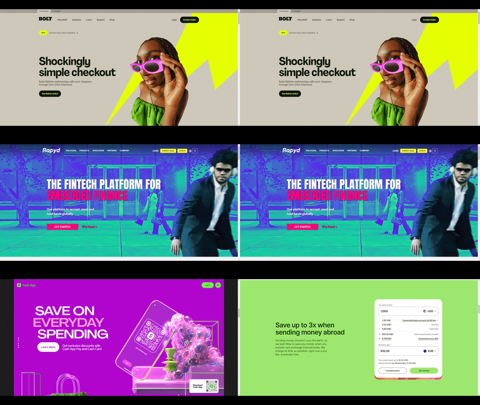
This strategy will be effective for a few use cases:
Bold colors don’t necessarily mean covering your interface with the boldest or brightest colors. That said, Cash App and Rapyd do a pretty good job of it if you’re looking for examples to follow. But sometimes all that’s really needed is a bright pop up of color to capture users’ attention.
Gradients give designers the chance to add eye-catching swaths or tiny bits of color to the interface. For fintech companies wanting to instill trust through traditional blue hues, but wanting to play with the disruptive nature of their brand a bit, gradients are a fantastic choice.
Here are some of the gradients we see in fintech design today:
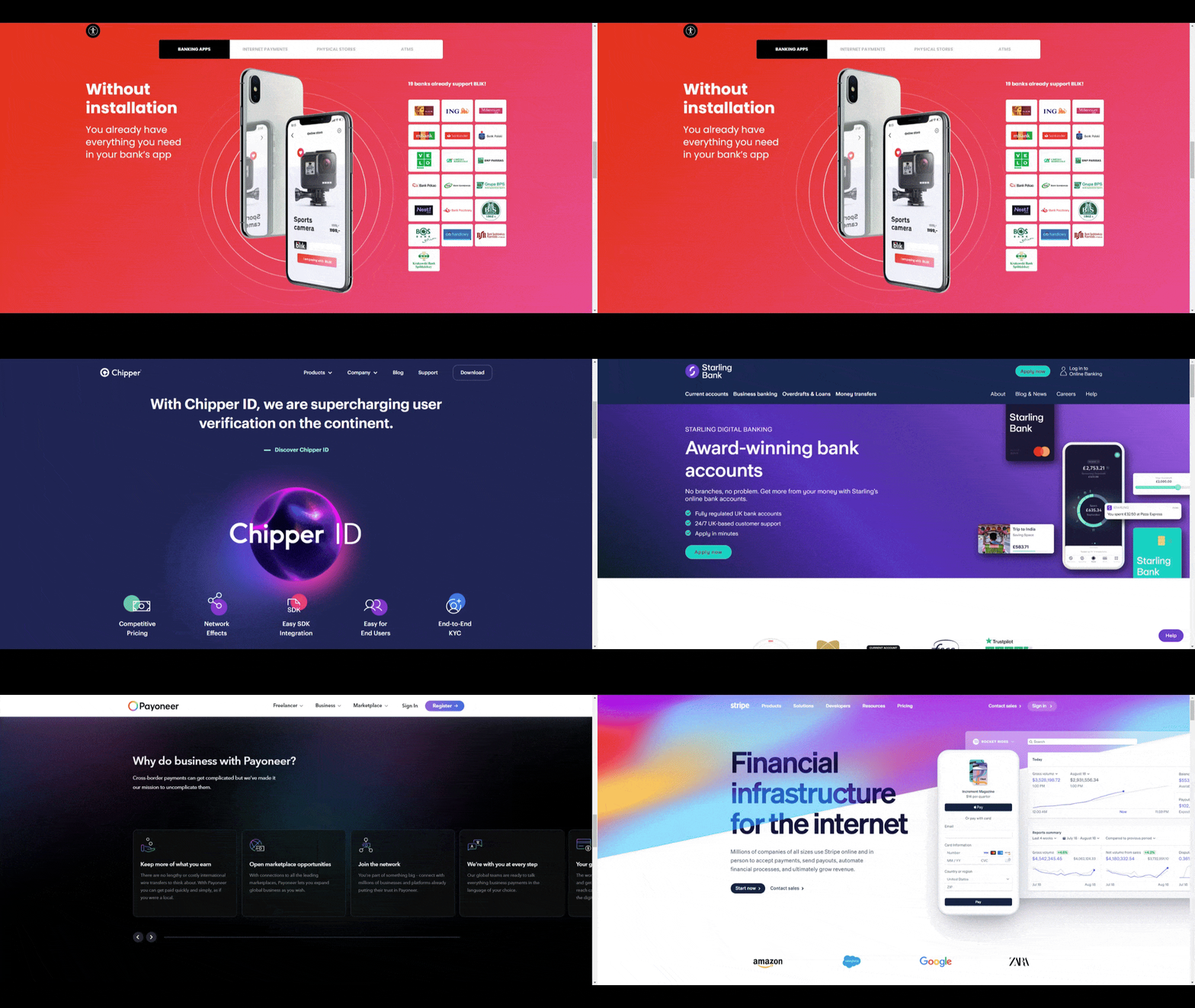
You can see how gradients add just a bit of spice to the design. If your clients are nervous about sending the wrong signals about the trustworthiness or stability of their product, a gradient could be a good way to make the UI visually interesting without overdoing it.
Fintech products tend to push the boundaries of what was once expected of traditional financial services companies. But does anything go when it comes to color?
That’s ultimately up to you to decide. There are various factors that come into play when choosing color. And with fintech, you not only need to consider what colors mean to your users, but how your choice of color will benefit your brand identity. With so many companies entering and disrupting the space, it might be worth it to take some risks with colors in your design.
There is a direct correlation between customer loyalty and user retention rates. However, loyalty can be a difficult thing to attain these days. Check out our Telerik blog for five customer loyalty features to help improve customer satisfaction and boost your fintech app’s retention rates.
Continue reading...
Whether you’re creating a logo and design system for a fintech company or you’re building their digital product, color is an important consideration. Do you go the way of traditional financial services companies and stick with safe and trustworthy blues? Or do you break free of that mold and experiment with bolder color choices?
In this post, we’ll look into the psychology of color. In particular, how it impacts fintech customers and then we’ll discuss ways to use it when designing fintech websites and apps.
The Psychology of Color and How It Affects Your Brand
Color doesn’t just make a UI look nice. It can be a powerful tool that enables a brand to invoke a certain emotion or response from those who encounter it. Here’s why the psychology of color is especially important to think about when choosing color for fintech brands:
What is Color Psychology?
Color psychology is the study of how color influences human behavior as well as mood. When certain colors and color combinations are used in design, for instance, you can affect user satisfaction, engagement rates and even conversions.
In order to do this, you have to start with an understanding of what individual colors mean. For instance, here are some concepts and symbols that these colors are commonly associated with:
Blue:
- Security
- Traditionalism
- Loyalty
- Stability
- Trust
- Confidence
- Calm
Green:
- Money
- Wealth
- Growth
- Nature
- Abundance
- Healing
- Envy
Purple:
- Royalty
- Status
- Luxury
- Dignity
- Creativity
- Mystery
- The future
Black:
- Sophistication
- Style
- Formality
- Power
- Security
- Boldness
- Drama
White:
- Cleanliness
- Perfection
- Simplicity
- Empowerment
- Goodness
- Artificiality
- Emptiness
Red:
- Urgency
- Excitement
- Passion
- Danger
- Loss (like being “in the red”)
- Strength
- Power
Orange:
- Playful
- Energetic
- Happy
- Youthful
- Cheap
- Hopelessness
- Impatience
Yellow:
- Optimism
- Energetic
- Revitalizing
- Friendly
- Anxious
- Urgency
- Excess
As you can see, there’s a pretty broad range of interpretations and symbols associated with any one color.
Factors That Impact How Colors are Interpreted
The context in which the color is used, the hue, as well as the amount used can all impact how it’s interpreted. Color combinations can also alter how individual colors are perceived consciously (as visually pleasing) or subconsciously (as symbolic).
You also have to consider your target audience. How a color is interpreted in one culture may be completely different in another.
Not only that, you should take demographics into consideration when figuring out the psychological meaning and symbolism of the colors you’ve used. For example, color consultant Amy Wax suggests that there are generational colors.
Boomers, for instance, tend to prefer mature, practical and calming color palettes. Gen Xers “like exotic greens and reds, midwestern browns, and violets.” And Millennials have their own color named for them: Millennial Pink.
Another thing to consider is usability and accessibility. While colors can certainly be used to make your users feel a certain way, you don’t want them to get in the way of the basic usability of your product.
What are the Best Colors to Use When Designing Fintech Products?
Differentiation is crucial in the financial services space. With more fintech companies disrupting the space every year, your website and/or app needs to clearly distinguish itself from the rest.
Color is one of the first things that users notice, so that’s a great place to start. To give you an idea of what you’re up against when it comes to traditional financial services, here’s what some of the leading finserv company websites look like:

Here you see the homepages for:
They all look eerily similar. Solid white backgrounds. Blue accent colors. And the occasional hint of red. That said, you can see how these colors were consciously chosen to create a sense of safety and stability.
Thanks to the conservative color palettes used by traditional finserv companies, this gives you a lot of room to explore with fintech. But just because you can push the boundaries of color, that doesn’t mean that the usual rules of good design and UX don’t apply.
The colors you choose need to align with your brand identity and values. They should also instill trust. They should be memorable. Last but not least, they should be aesthetically pleasing.
With that out of the way, let’s talk about what kinds of colors and palettes work for fintech. Here are the most common trends I’m seeing:
1. Shades of Purple
Purple is a really common color used in fintech design. All different shades are used too, which is probably because the brands want to send different signals to their users.
Here’s a look at how the following fintech brands use purple:

If we look back at the significance of purple, there would be numerous ways to interpret these colors. I definitely think in each case, purple is supposed to suggest that these are forward-thinking brands that will carry their users into the future.
The color also might be used to convey a sense of luxury or ingenuity in certain cases.
2. The Bolder the Better
There are numerous brands that are throwing caution to the wind and going big and bold with color, like:

This strategy will be effective for a few use cases:
- Targeting younger users (like young millennials and Gen Zers)
- Launching a product in a congested market
- Launching a game-changing, disruptive product that’s never been seen before
Bold colors don’t necessarily mean covering your interface with the boldest or brightest colors. That said, Cash App and Rapyd do a pretty good job of it if you’re looking for examples to follow. But sometimes all that’s really needed is a bright pop up of color to capture users’ attention.
3. The Occasional Gradient
Gradients give designers the chance to add eye-catching swaths or tiny bits of color to the interface. For fintech companies wanting to instill trust through traditional blue hues, but wanting to play with the disruptive nature of their brand a bit, gradients are a fantastic choice.
Here are some of the gradients we see in fintech design today:

You can see how gradients add just a bit of spice to the design. If your clients are nervous about sending the wrong signals about the trustworthiness or stability of their product, a gradient could be a good way to make the UI visually interesting without overdoing it.
Wrap-up
Fintech products tend to push the boundaries of what was once expected of traditional financial services companies. But does anything go when it comes to color?
That’s ultimately up to you to decide. There are various factors that come into play when choosing color. And with fintech, you not only need to consider what colors mean to your users, but how your choice of color will benefit your brand identity. With so many companies entering and disrupting the space, it might be worth it to take some risks with colors in your design.
Customer Loyalty Features for Fintech Products That Improve User Retention
There is a direct correlation between customer loyalty and user retention rates. However, loyalty can be a difficult thing to attain these days. Check out our Telerik blog for five customer loyalty features to help improve customer satisfaction and boost your fintech app’s retention rates.
Continue reading...
