
T
Thierry Ciot
Guest
Learn how to create custom components from Angular components in Kendo UI Builder, making it easy to take advantage of the rich UI tools while extending your own code.
In my previous post, we saw how to create a Kendo UI Builder custom component using plain HTML for rendering. Sometimes you will want to create a custom component that reuses an Angular component, most likely because you have existing code you want to leverage or you want to use a third-party component.
After doing this, the component can participate in Kendo UI Builder design and code generation phases. The benefits are:
Additionally, you can define properties to make the component configuration a complete no-code solution.
In this blog post, we will see how you can wrap a very simple “Hello World” Angular component inside a Kendo UI Builder custom component. The Angular component will accept an input called “greeting” and will render it as a prefix to the string World. Then, we will create a Kendo UI Builder custom component that encapsulates the Angular component. The custom component has one design time property, “greeting,” that will be passed automatically to the Angular component.
To follow along, download the template sample zip from github or clone this repository; open the folder components/custom-hello-world-ang-comp and follow the same steps outlined in this post to install this template in your target application. The sample is specific to the Angular framework (it is not applicable to AngularJS).
The Hello World Angular Component
The Angular component is located in the Github folder: components/custom-hello-world-ang-comp/customcomp/hello-world.component.
It was generated with the Angular CLI tool using the command:
ng generate component hello-world
See Angular's site for more on installing the CLI, and you can check out the documentation for the generate command for more on that.
Angular components are the fundamental building blocks of any Angular application. They are composed of:
The decorator and controller specify, among other things, how the component will be invoked. The controller is defined in the file components/custom-hello-world-ang-comp/customcomp/hello-world.component/hello-world.component.ts
@Component({
selector: 'custom-hello-world',
templateUrl: './hello-world.component.html',
styleUrls: ['./hello-world.component.css']
})
The selector specifies the tag name we will use in our Html to create an instance of the component.
@Input() greeting: string;
This specifies that our component accepts an input named greeting. You can read this for details on component interactions.
As a result, the component can be invoked like this:
<custom-hello-world greeting="hello"></custom-hello-world>
The controller also specifies what is rendered via the templateUrl attribute. The template is defined in components\custom-hello-world-ang-comp\customcomp\hello-world.component\hello-world.component.html
<span>{{greeting}} world</span>
We just create a span and prefix world with the content of the greeting input at runtime.
This simply outputs: <span>hello world</span>
For more details on Angular components, check out the documentation.
Now that we know what our Angular component does, it’s time to see how we can wrap it in a Kendo UI Builder custom component
Custom View Definition File
Open the file: components/custom-hello-world-ang-comp/custom-hello-world-ang-comp.json
You will recognize the content of this file as it’s almost exactly the same as the one we defined back in our introduction to Kendo UI Builder custom components.
The only differences are the component id and name. So, from a Kendo UI Builder point of view, these kind of components are defined the same way as any other components.
Design-Time
Similarly, when you open the design folder, you will notice that the file contents are identical.
This is not surprising. After all, the main point of the Kendo UI Builder designer is to design applications, views and components in a target framework agnostic fashion.
All in all, this is good news: you don’t need to learn something new and specific for defining the component and the design-time rendering.
Run-Time
Now, we are getting into the heart of this blog: How our custom component wraps the Angular component and passes data to it.
First, we need to pass the greeting property that the user enters in the property panel to the Angular component controller.
This is achieved with file config.json.ejs.
{
"greeting": "<%- greeting %>"
}
This effectively defines which component properties will get added to the components elements of the $config variable in the generated code.
As a reminder from the previous blog post, these properties are indexed by the component unique id to ensure we can use more than one instance per blank view.
Here is an example from my generated code when I use two instances of the component on the same blank view:
public $config: any = {
components: {
};
This file is located at (for a blank view called hw-ang-comp) app\src\app\modules\custom-components\hw-ang-comp\ hw-ang-comp.view.base.component.ts
Second, we need to define the template. See components/custom-hello-world-ang-comp/angular/template.html.ejs:
<custom-hello-world
greeting="{{$config.components.<%-id%>.greeting}}">
</custom-hello-world>
Here we invoke the Angular component and pass the input parameter. Notice how we use the id property to access the specific instance of the greeting property.
Steps to Use the Sample
Here are the steps to take:
If you were to use the sample as-is you would get an error stating that you are missing the Angular component. At the console you get:
ng:///HWCompViewModule/HWCompViewBaseComponent.html@19:20
'custom-hello-world' is not a known element
So, the last step is to make the Angular component available to the app:
Now, from Kendo UI Builder click 'Start Server' and 'Open in Browser.' You should see the view with each configured instance of the component.
Conclusion
As you can see, wrapping an Angular component inside a Kendo UI Builder component is easy and provides numerous benefits:
Now, you can provide a designer tool to your development teams that not only comes bundled with a very large suite of components and pre-defined views, but also extends to your in-house code as well as third party components.
If you jumped into this series in the middle and want to start from the beginning, you can find the previous blog posts here:
Continue reading...
In my previous post, we saw how to create a Kendo UI Builder custom component using plain HTML for rendering. Sometimes you will want to create a custom component that reuses an Angular component, most likely because you have existing code you want to leverage or you want to use a third-party component.
After doing this, the component can participate in Kendo UI Builder design and code generation phases. The benefits are:
- You can design, with simple point and click, views that include your component
- The component can participate in the responsive views
- It can interact with the data source and data model defined for the view
Additionally, you can define properties to make the component configuration a complete no-code solution.
In this blog post, we will see how you can wrap a very simple “Hello World” Angular component inside a Kendo UI Builder custom component. The Angular component will accept an input called “greeting” and will render it as a prefix to the string World. Then, we will create a Kendo UI Builder custom component that encapsulates the Angular component. The custom component has one design time property, “greeting,” that will be passed automatically to the Angular component.
To follow along, download the template sample zip from github or clone this repository; open the folder components/custom-hello-world-ang-comp and follow the same steps outlined in this post to install this template in your target application. The sample is specific to the Angular framework (it is not applicable to AngularJS).
The Hello World Angular Component
The Angular component is located in the Github folder: components/custom-hello-world-ang-comp/customcomp/hello-world.component.
It was generated with the Angular CLI tool using the command:
ng generate component hello-world
See Angular's site for more on installing the CLI, and you can check out the documentation for the generate command for more on that.
Angular components are the fundamental building blocks of any Angular application. They are composed of:
- A component decorator
- A controller
- A template
The decorator and controller specify, among other things, how the component will be invoked. The controller is defined in the file components/custom-hello-world-ang-comp/customcomp/hello-world.component/hello-world.component.ts
1.
2.
3.
4.
5.
The selector specifies the tag name we will use in our Html to create an instance of the component.
1.
This specifies that our component accepts an input named greeting. You can read this for details on component interactions.
As a result, the component can be invoked like this:
<custom-hello-world greeting="hello"></custom-hello-world>
The controller also specifies what is rendered via the templateUrl attribute. The template is defined in components\custom-hello-world-ang-comp\customcomp\hello-world.component\hello-world.component.html
1.
We just create a span and prefix world with the content of the greeting input at runtime.
This simply outputs: <span>hello world</span>
For more details on Angular components, check out the documentation.
Now that we know what our Angular component does, it’s time to see how we can wrap it in a Kendo UI Builder custom component
Custom View Definition File
Open the file: components/custom-hello-world-ang-comp/custom-hello-world-ang-comp.json
You will recognize the content of this file as it’s almost exactly the same as the one we defined back in our introduction to Kendo UI Builder custom components.
The only differences are the component id and name. So, from a Kendo UI Builder point of view, these kind of components are defined the same way as any other components.
Design-Time
Similarly, when you open the design folder, you will notice that the file contents are identical.
This is not surprising. After all, the main point of the Kendo UI Builder designer is to design applications, views and components in a target framework agnostic fashion.
All in all, this is good news: you don’t need to learn something new and specific for defining the component and the design-time rendering.
Run-Time
Now, we are getting into the heart of this blog: How our custom component wraps the Angular component and passes data to it.
First, we need to pass the greeting property that the user enters in the property panel to the Angular component controller.
This is achieved with file config.json.ejs.
1.
2.
3.
This effectively defines which component properties will get added to the components elements of the $config variable in the generated code.
As a reminder from the previous blog post, these properties are indexed by the component unique id to ensure we can use more than one instance per blank view.
Here is an example from my generated code when I use two instances of the component on the same blank view:
public $config: any = {
components: {
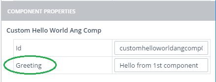
customhelloworldangcomp0 : {
"greeting": "Hello from 1st component"
},
customhelloworldangcomp1 : {
"greeting": "Salutations from 2nd component"
}
}};
This file is located at (for a blank view called hw-ang-comp) app\src\app\modules\custom-components\hw-ang-comp\ hw-ang-comp.view.base.component.ts
Second, we need to define the template. See components/custom-hello-world-ang-comp/angular/template.html.ejs:
<custom-hello-world
greeting="{{$config.components.<%-id%>.greeting}}">
</custom-hello-world>
Here we invoke the Angular component and pass the input parameter. Notice how we use the id property to access the specific instance of the greeting property.
Steps to Use the Sample
Here are the steps to take:
- Create App with Kendo UI Builder
- Exit Kendo UI Builder, copy the custom component to the templates\components directory and restart
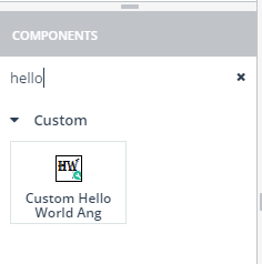
- Add a blank view—you should see the custom component at the bottom of the component palette, or type hello in the search box
- Add a couple of instances of this component and change the greeting property for each
- Generate the app
If you were to use the sample as-is you would get an error stating that you are missing the Angular component. At the console you get:
ng:///HWCompViewModule/HWCompViewBaseComponent.html@19:20
'custom-hello-world' is not a known element
So, the last step is to make the Angular component available to the app:
- Copy the folder customcomp to app\src\app\shared
- Register the Angular component to the Angular Module system. Kendo UI Builder has provides for this with a file called shared.module.ts. This file content is preserved every time the app is generated.
- To register our component we add the following code to app\src\app\shared\shared.module.ts:
import { HelloWorldComponent } from './customcomp/hello-world.component/hello-world.component';
config.declarations.push(HelloWorldComponent);
config.exports.push(HelloWorldComponent);
- To register our component we add the following code to app\src\app\shared\shared.module.ts:
Now, from Kendo UI Builder click 'Start Server' and 'Open in Browser.' You should see the view with each configured instance of the component.
Conclusion
As you can see, wrapping an Angular component inside a Kendo UI Builder component is easy and provides numerous benefits:
- Point and click/drag-and-drop design of views that include any components
- Interaction with data sources and data models defined for the view
- Components automatically participate in responsive views
- Components can be configured and used in a low-code/no-code fashion, improving team's productivity
Now, you can provide a designer tool to your development teams that not only comes bundled with a very large suite of components and pre-defined views, but also extends to your in-house code as well as third party components.
If you jumped into this series in the middle and want to start from the beginning, you can find the previous blog posts here:
- Introduction to Kendo UI Builder Templates
- Behind the Scenes of Kendo UI Builder Templates
- Event Processing in Kendo UI Builder Templates
- Augmenting Models in Kendo UI Builder Templates
Introduction to Custom Components for Kendo UI Builder
Continue reading...